 “In the context of widening political divides and growing economic inequalities, we call on architects to imagine spaces in which we can generously live together”. With this effective assertion, Hashim Sarkis, curator of the 2021 Biennale, summarizes the objectives of the 17th International Architecture Exhibition, currently ongoing in Venice. It is no coincidence that these questions come to light during the pandemic crisis, that has awakened urgent attention towards the global environmental emergency and the priorities established by the UN 2030 Agenda, at the centre of which is the theme of sustainable development and measures to combat climate change, desertification, poverty and to favour the socalled ecological transition. Therefore only a global change in lifestyles can mark a change and we need to call upon architects to contribute to new visions of the world. From these reflections, we started looking curiously at what architects were doing, with the idea of identifying the orientations and approaches of some of the most well-known contemporary designers in their latest creations. A selection of highly iconic buildings has emerged, in which the aesthetic composition is based on the pursuit of uniqueness and originality. These architectures rely on their capacity to direct attention to the designer’s authorship and originality, to the prestige of the client or to the attractiveness of the urban context to which they belong and are marked by a sophisticated self-referentiality. The opportunity to leave a mark in the most disparate places on the planet seems to prevail over the commitment in dealing with today’s complex social and environmental problems. The works of great architects have always played an important role in enhancing power relations within societies and the same happens today, with iconic architecture at the service of the capitalistic globalization. As argued in Leslie Sklair’s essay, the difference is that while until the mid-1950s architecture was mainly linked to the interests of state and/or religious power, contemporary architecture tends to express the demands of those who owns and controls large transnational scale corporations. Architectural products, with their exhibited formalisms, contribute in an incisive way to convey the client’s demands. Exemplary in this sense are the department store in South Korea by OMA, the LUMA Cultural Centre in Arles by Frank Gehry and the Atelier Audemars Piguet Museum in Switzerland by BIG. The distinctive features of these buildings are strongly linked to the promotional message required by the respective lenders. OMA’s building, a monolith with a sculptural appeal that suddenly emerges in the fabric of the “generic city”, plays on the theme of displacement through material effects, hybridizing the classic typology of a commercial hub with the presence of a public promenade that breaks free of the volume and protrudes on the façade in the form of a faceted geometric glazed tunnel. Also Gehry relies to the sculptural behaviour as the only way to bring out its tower in Arles. The swiss heiress Maja Hoffmann imagined the “architect of free forms” as the ideal designer of the master plan and principal building of this cultural hub in France. A more subtle operation, based on similar principles, is that carried out by BIG in the building commissioned by the famous watchmaker Audemars Piguet, to exhibit its products and renew the image of the company. In this case the context, which is the typical swiss alpine environment, offers the opportunity to design an almost perfect icon: the building, with its double spiral movement, evokes the mechanics of clocks and, thanks to the green roof, integrates perfectly into the surrounding landscape. Observing the above mentioned works, together with the others presented in this issue, one aspect emerges clearly: architecture holds today an high and effective communicative power; it is an integral fragment of the media system and takes part in it with singular exploits that often carry the aesthetic dimension well beyond the simplest correspondence between form, function, structure, context. Going back to the initial issue, several questions arise: can the architectural project still be supported by a social and political vision or it is a mere response to the needs and requests of a client? The architect is still able to play an intellectual role? Is he still capable, through the construction of space, to anticipate the society of the future? The modern idea of architecture as fundamental part of the construction of new cultures and civilisations is definitively outdated?
ARCHITECTURES AS URBAN ICONS – Pg. 6
Editorial by Domizia Mandolesi
THE ROLE OF ICONIC ARCHITECTURE IN GLOBALIZING URBAN MEGAPROJECTS – Pg. 8
Leslie Sklair
TRANSNATIONAL ARCHITECTURE AND URBANISM. TRANSFERRING PROJECTS AND RELATING TO URBAN CONTEXT – Pg. 26
Davide Ponzini
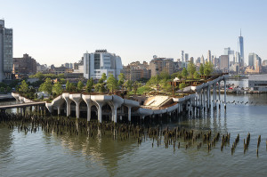 Greening as an Expressive Code for the Urban Space
The commission for this project was received by the London office in 2013 from the Hudson River Park Trust. The client initially asked for a new pavilion to be situated atop a new pier floating on the Hudson River. Thomas Heatherwick recalls how, upon receiving this request, the team saw an opportunity to develop a site that would further involve New Yorkers by offering them an unusual public park. The project thus pursued the ambition of providing visitors a unique spatial experience: the excitement of being over the water, the feeling of leaving traffic behind and being immersed in greenery. This 11,000 square metre floating urban oasis is suspended above 132 columns of differing heights, surmounted by prefabricated concrete “pots”: true and proper sculptures designed by Arup, whose organic forms, inspired by natural vegetation, produce a unique artificial wilderness solidly rooted to the river bottom. Thomas Heatherwick defines the columns that support this complex artificial topography as the true “heroes” of the project, capable of transforming the load bearing structure into “scenographic flowerpots” that create a “richly-planted undulating landscape”.
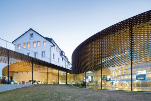
The maison Audemars Piguet, one of the oldest and most prestigious watchmakers in the world, boasts the creation of timepieces that have set benchmarks. Recently, a company with such an illustrious history felt the need to launch a strong signal to represent itself to the world, to tell its story and build a bridge between past and present. It was inevitable that architecture was selected to symbolise this change; it was inevitable that the choice was made to reinforce its roots in Le Brassus, where its historical headquarters have dialogued for over one hundred and fifty years with the natural setting of the Swiss Alps. The impulse behind the programme is clear: the new building was to represent a deeply rooted historical pre-existence and a typical landscape; it was to develop the idea of a museum that recounts the company’s past and present, linking together an exhibition route and an active space of production; finally, it would have to communicate in the most efficient manner the values of an historical company that has chosen to renew itself and wants to tell its story. This combination of inputs and suggestions produced the form, not selected for its intrinsic value, but for the type of “performance” it guarantees: the path through the museum was curved into the form of a double spiral, the absolute symbol of the notion of “perpetuity”. Using the same materials employed to make watches and the same spirit, the project “infused energy, movement, intelligence and measure” not to speak about time, but in this case about the art of measuring it.
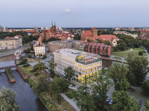 An Informal Graft as Means of Emphasising Figurativeness
During the final throes of the Second World War, Wrocław was almost totally razed to the ground. In May 1945 only one nineteenth century building had survived standing on a small island in the midst of the Oder River. Unresolved within the plan to rebuild the city, in recent years this building attracted a growing number of young people whose attentions consecrated Słodowa Island as a meeting place for the younger generations. After purchasing it, in 2018 Concordia Design commissioned MVRDV to design its refurbishment and expansion. The intention was to transform it into the company’s new headquarters in Wrocław, in the form of a mixed-use complex with a bar, rooms for events, a restaurant and spaces for co-working. The project by MVRDV preserved the elements of this urban symbol, transformed by structural grafts and integrations that are both distinguishable and declaredly contemporary. The historical façade is juxtaposed against the contemporary addition. A tripartite element defines pared down elevations that recover the rhythms and heights of the pre-existing walls, to then translate them at the most extreme end, where the architectural volume is dematerialised by an enormous glass wall that encloses the triple-height entry. Thus grafts and pre-existence work in synergy, even if in formal terms the former is heavily pared down and appears to be supported more by its content and context than the intrinsic qualities of its general morphology, which is substantially “informal”.
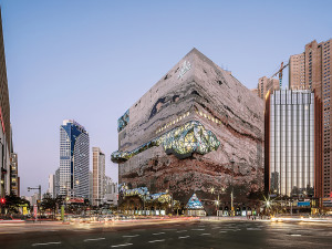 A Sculpted Monolith in the Generic City
Recently the city of Gwanggyo inaugurated the sixth department store operated by the Galleria chain, founded in 1970 and still one of the country’s most important.
The design is the work of OMA, a practice that boasts a lengthy experience in “non-conventional” commercial buildings. The true soul of this building consists of two extremely different yet complementary elements. On the one hand a large, solid and opaque stereometric volume hosting the commercial functions; on the other hand, a ribbon that wraps and carves into the building to create a succession of voids that define the truly innovative aspects of the project. These two elements coexist in a symbiotic relationship and it would be impossible to imagine the one without the other. The strength of the project lies in the dialectic resolution of this apparent opposition. The building presents itself as a large and introverted object, a monolith that clearly delimits an inside and an outside. This rigidity is interrupted by the 540 metre-long public promenade that traverses it and connects the ground floor with the roof in an uninterrupted ribbon, thanks to a succession of spaces and terraces hosting cultural activities such as exhibitions and performances. For the architects, the new building was intended to create a synthesis between its urban context, characterised by a rigid grid of large traffic arteries and tall residential towers, and the large park adjacent to it fronting Lake Suwon. Thus natural and artificial, solid and void, stone and glass, are combined to create a special object that ruptures the monotony of the planned city.
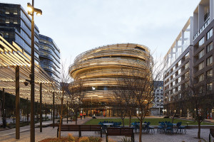 An Oasis in the Urban Jungle
The area of Darling Harbour, west of the city of Sydney, has been the object in recent decades of a planning process aimed at improving public and recreational spaces
to integrate other urban functions. Within this programme to revitalise the area, the design of Darling Exchange, a mixed-use civic building, assumes a barycentric role, offering a moment of pause in events unfolding along the Boulevard. In this context, in 2016, Kengo Kuma & Associates won the competition to design a multiuse building that hosts a covered market, a public library, services for infants and a bar/restaurant. The building is exploitable in 360 degrees, inviting the use of the ground floor as an expansion of public space. The plaza and the market become an extension of one another. The Market Hall is a double-height space whose edges are dematerialised by a glass façade. The stepped ramp to the mezzanine of the market loses its purely functional role to become a dilation of the ground plane offering a space to spend time and meet others. Kuma once again uses wood as the distinctive element of the project. A 20 km conifer wood ribbon wraps the glass building in a spiral, defining an envelope that visually marks its diversity and the speed of urban and natural flows. The central plan produces a free, ventilated and light-filled space inside which, on each floor, we can find the same permeability evident at the point where the building touches the ground.
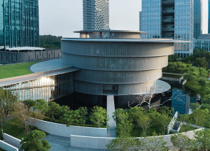 A Solemn Space in an Hybrid Urban Landskape
This art museum designed by Tadao Ando in Foshan was promoted by a patron who wished to create a new centre for promoting autochthonous culture and spreading
art among the community. The search for aulic space in a site bounded by a traffic-burdened commercial district to the south and a public park to the north nonetheless requested the mitigation of the effects of its noisy surroundings. The connection with the city is emphasised by paths that radiate out from the main building, crossing a landscape that dialogues with the water and planted areas. Chinese symbology guided the formal composition of the museum: four overlapping cylinders expand upward, projecting out over the floors below in an eccentric manner. To the north-east, a large full-height parallelepiped intersects the main building balancing the dominant curved character with a rectilinear counterpart. Inside, circular rooms intersect others characterised by the square perimeter and their interaction generates dynamic conflict through spatial differences. At the centre of the main volume, a large void defines the spatial nucleus that constitutes the hinge of the diverse levels of the gallery that slide past one another. The conception of the building, founded atop a typically Japanese spatiality, with the desire to evoke an interior world, nonetheless reveals a hybrid sensibility, mediated by the choice of construction technologies and a use of light that Ando himself refers to as “Western”.
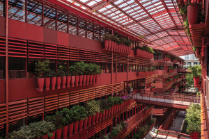 A Urban Path inspired by Nineteenth-century Passages
Built volume and the void space inside it complement one another to define the image of this building, one of the most recent works by Ateliers Jean Nouvel.
The building is the result of the almost obsessive repetition of standardised façade elements. However, the different colours assigned to them on the interior and exterior elevations create a totally different impression between what is outside, which seeks a relationship with its urban setting, and what is inside, a void treasure chest that is more private and welcoming. The principal objectives of the project included the realisation of a new urban connection between the two streets delimiting the east and west elevations of the building; set into the existing city fabric, the building generates an unexpected commercial street, a true and proper passage inspired by the later nineteenth century gallerias of Paris. The “Street of 1000 Red Jars” – the name given to the project by its authors – is the result of the collaboration between Ateliers Jean Nouvel and local landscape architects ASPECT-Studios. Not only the colour of the façade, but also the selection of plant species participates in the distinction between inside and outside, turning the elevations in a vegetal surface in perpetual transformation.
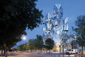 Form, Function, Context in the Virtuous Plasticism of Frank Gehry
The Swiss heiress Maja Hoffmann, head of the LUMA Foundation, imagined an architect of free forms of the calibre of Frank Gehry as the ideal designer of the master plan and principal building of this cultural hub in France. In correspondence with the remains of a nineteenth century railyard, the campus extends across 11 hectares. The sculptural object designed by the Canadian architect is part of a collection of linear buildings once used to assemble and repair locomotives, set in a vegetal pattern typical of the Mediterranean region. An all-glass three storey tall circular drum serves as a podium for the tower and invites visitors to enter; from the centre of this porous base, the building takes the form of an aggregation of four smaller towers, interconnected and attached to a concrete backbone containing the lifts and stairs. The hinge of the campus reaches the apex of its expressive strength in the treatment of the surface of this upper element, facing toward the historical city centre: a jagged and apparently formless mass of 11,000 stainless steel panels, each with a precise number and inclination. Regarding the controversial geometry of the tower, it is highly likely that it is the result of a common intention – shared by the client and architect – to erect a true and proper “pictorial building”, coherent with its function. The tower fundamentally refers to what it contains and appears to have been modelled with precision to contain it.
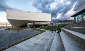 A Dynamic and Inclusive Space as Metaphor of Sport
The desire to become a representative icon of the Olympic Games and Olympic and Paralympic Athletes is what drove the design of the museum completed in 2020 by Diller Scofidio + Renfro. The museum complex can be read as a composition of two systems: that constituted by its public spaces and the museum building itself, the absolute protagonist of the composition and a counterpoint to both the landscape and the city. The theme of movement as change and transformation through space and time, together with the recognisability of material, appears to be the fil rouge that runs through all of the office’s work. It is well adapted here to the design of a museum that celebrates the world of sport and Olympic and Paralympic athletes. Inspired by the energy and equilibrium of an athlete’s body in movement, the design of the museum is born of an idea of controlled dynamism. The total absence of architectural and visual barriers is a founding concept of the project. The different floors and various areas of the museum are not only accessible to everyone, but designed such that the experience of the museum is the same for anyone who visits it. On all floors, the exhibition halls alternate with spaces designed for different functions, transforming the building from a simple museum into a space of gathering, meeting and entertainment for the community.
ARGOMENTI
– DISAMBIENTAMENTI. Prove di incisione di Carmelo Baglivo – Pg. 112
– L’opera di Myron Goldsmith, architetto-ingegnere del XX secolo – Pg. 116
– Silvano Stucchi, l’ingegnere, professore universitario con la passione per l’acquerello – Pg. 122
NOTIZIE – Pg. 124
LIBRI – Pg. 126
Questo post è disponibile anche in: Italian


