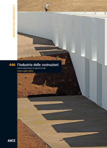
This second edition of l’industria delle costruzioni dedicated to Portugal (vd. issue n. 405/2009) offers a cross section of architecture in a country that, despite the economic crisis that began in 2008, continues to offer valid examples of quality and occasions for experimentation. After a period of rapid development, stimulated by EU funding from previous years, the Portuguese construction industry was the first to suffer a sudden slow down. A halt to works in the public sector had dramatic consequences on a vast range of activities, including the work of architectural practices and engineering offices. The repercussions of this crisis are also evident in dropping enrolment in respective university faculties and an increasingly more frenetic search for professional opportunities on the international market. A population of ten million, comparable to that of a large city, and a peripheral position with respect to Europe’s most important nations and metropolitan centres, hint at Portugal’s difficulties in competing in a global economy governed by market logics whose equilibriums and trends are determined by the largest and most powerful. The last great territorial project, the Porto Metro (1999-2005), coordinated by Eduardo Souto de Moura and witness to the participation of more than 11 architects and groups of specialists, represents the swan song of what could be considered the realisation of an idea of the contemporary city comparable to the expectations of that part of the Modern Movement that aspired to design, “from the spoon to the city”. Without flaunting social ideologies, this project restored architecture to the centre of the construction of the city of today, both in its role as an autonomous discipline and in the collective dimension responsible for introducing modifications and for the quality of the artificial environment. This project applied a working method garnered from continuous practice, and which sums up the distinctive characteristics of a School of thought. The opening this year of the Museu dos Coches in Lisbon, only partially realised, designed by Paulo Mendes da Rocha (another Portuguese speaking Pritzker Prize winner) in collaboration with the young and talented Portuguese architect Ricardo Bak Gordon, nurtured a historic process of cultural contamination that represents a further quality of recent architecture. The projects presented in this issue represent a small part of a qualified and vaster body of work that, despite the limits imposed by a situation of extreme austerity, testify to the vitality and expressive capacities of recent Portuguese architecture.
CONTEMPORARY PORTUGUESE ARCHITECTURE – Pg. 4
Michele Cannatà e Fatima Fernandes
 In 2003 the municipality of Chaves commissioned Álvaro Siza with the design of a new Foundation dedicated to the city’s famous son Afonso Nadir, one of Portugal’s most important painters and architects of the twentieth century. The corner stone was laid in 2011 and the Foundation inaugurated recently. The building sits on a 17,000 square meter site with an elongated triangular form, inserted between the historic centre of Chaves and the Tamega River. The one story building has a floor area of 2,500 square meters. It runs the entire length of the site as a rectangular plan modified by torsions and deep cuts. The building is accessed from a pedestrian bridge grafted along one third of its length. n. To the south, Siza has placed a 100-seat auditorium, a block of services and the library; to the north are a cafeteria, two exhibition galleries, the archives, a study hall and offices; to the extreme north is Afonso Nadir’s last atelier.
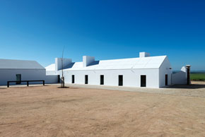 A solitary object in the uncontaminated landscape of Alto Alentejo, the Torre de Palma Wine Hotel is the result of the renovation of a rural property to create a high standard destination for tourists. The project by João Mendes Ribeiro alternates between building renovation, interior design, new construction and the redesign of the landscape, generating a varied though morphologically organic project. Where possible the existing structures were conserved, while new constructions instead assume a twofold importance: new extensions exist alongside substitutions of original structures that were no longer necessary. The original complex contains the principal functions for welcoming and hosting guests: the entry hall, bar, wellness centre and guest rooms. The new buildings are home to the restaurant and wine cellars.
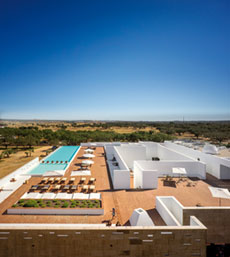 Inaugurated in 2013, this hotel complex in the periphery of the inland Portuguese city of Évora is the work of Josè Carlos Cruz. The Ecork Hotel, with a total area of 6,300 square meters, is characterised by an essential and introverted design that clearly sets it apart from its rural surroundings. Purity, simplicity and sobriety are the fundamental features of the complex, constructed using traditional local materials and techniques.The hotel consists of a main building hosting all of the communal services, and 56 independent suites separate from the main volume that define a sort of micro-city. This layout was inspired by the traditional medieval towns of the Alentejo, characterised by the juxtaposition between a main castle surrounded by a host of small white constructions. Emphasising this fortress-like quality is the square plate of the main two-storey building, which is partially surrounded by a pool of water.
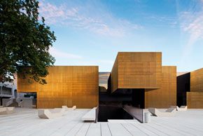 The Platform of Arts and Creativity introduces a new identity in the urban landscape of this historic Portuguese city. It also represented an opportunity to rehabilitate and reconfigure the part of the city in which it is situated. The project site occupies a privileged position corresponding with the area of the historic municipal market, near Largo do Toural and various buildings from the 1930s.The program for the transformation of the market into a multipurpose space for artistic, economic, cultural and social activities included the renovation of two existing buildings and the construction of a new volume. At the urban scale the Platform consists of three distinct volumes that circumscribe a large public space; articulated on two levels, it is entrusted with the role of re-stitching the lower level of the city to the west with the upper level toward the east.
 The Convento das Bernardas in the Algarve town of Tavira, designed by Eduardo Souto de Moura between 2006 and 2009 and completed in 2012, involves the conversion of a large former monastery and former factory into a residential complex. Situated in a level area, raised slightly with respect to the local salt works, the buildings of the Convento das Bernardas define a rectangular courtyard. The appearance is that of a compact structure, exalted by the choice to finish the façades with a colour that resembles the hues of the salt works. Viewed from up close, the details of the façades reveal the sedimentations and stratifications of diverse eras. Inside the courtyard a large reflecting surface of a square pool mirrors the façades and trees.
 The site of this project is situated at the edge of the historic centre. It involved the reuse of an existing building and the construction of a new scholastic centre for 3 kindergarten classes and 12 elementary school classrooms. The site of the expansion is strongly conditioned by pre-existing elements, but also by an irregular geometry and level changes, as well as the proximity to a monumental spring and an important work of religious architecture. These various elements demanded a particular attention, above all in relation to the new volume and the choice of materials. The result ensures the correct integration with context, highly visible in this part of the city.The architecture evokes the stylemes of Mediterranean construction, less for the use of white plaster and the semantic qualities of its forms, and more for an innovative layout attentive to context and the memory of Portuguese architecture.
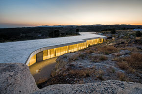 This building is situated in the province of Viseu, in the heart of northern Portugal, known for its wine production. The plan is a characteristic zig-zagging line derived from a study of the contours of the promontory that hosts the building. The project is a minimal intervention inserted within a natural setting, imposing and maintaining an artificial horizon. Particular attention was focused on the landscape aspects of the design. The volume of the building is compact and defined by a clear horizontal line. The roof is unencumbered by any accessory volume that would interrupt the view or movement. The height of the building is limited to one storey, with the various elements of the program unfolding in a long line.
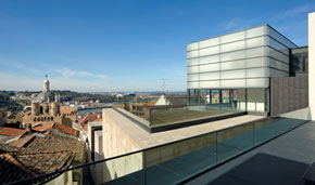 The building designed by Gonçalo Byrne sits on an artificial surface consisting of a cryptoporticus from the mid 1st century AD, atop which stand a church from the seventeenth century and the bishop’s palace. They create a courtyard configuration closed to the west by a loggia from the sixteenth century. The project is the result of a study of the transformations of the bishop’s palace over the centuries. This process identified the single “individualities” in order to rework them as part of a unitary design. The most important interventions are concentrated in the northwest wing of the complex. A fragmented succession of spaces is restored to a more unitary layout that is expressed in the façade by elementary and recognisable forms and through the use of stone to exalt the formal purity of the design.
 This building is situated in Alcácer do Sal, a Portuguese town of Roman origins in the district of Setubal. Commissioned by the Santa Casa della Misericordia, this housing project for self-sufficient and partially self-sufficient elderly people occupies a marginal area along the edge between a vast and largely untouched natural area and the most recent expansion of the town. The sloping site looks toward a number of existing buildings that have been incorporated within the project. The position and characteristics of the site suggested that the architects work with a single volume. A sculpted monolithic wall that delimits and defines open space and organises the entire site, the building was conceived as a “path” that winds in different directions, rising naturally from the fractured topography.
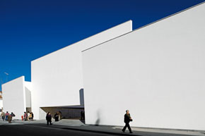 This stark white and geometric complex is distinguished by the essential simplicity of its minimalist architecture. The design is also a reaction to a consumer society marked by its love of the material, excess, appearance and image. In this world of waste, the architect instead proposes a work of architecture stripped of any ornament. Minimalism seeks the true essence of architecture, all that is authentic and essential. The architecture of the church presents a strong harmony between archetypal religious forms and minimalism. The church and parish centre form a C-shaped plan, designed in a close relationship with the landscape and the natural setting to become a sort of landmark for the city. The almost impenetrable walls are a curiosity that draw the faithful in, accompanying them toward the entrance, in the form of a low and broad portal.
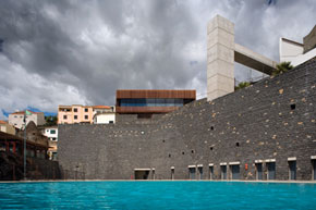 The site of this project by Paulo David is marked by the intensity of the Atlantic Ocean, the raw power of the steep cliff, the beach of stones and farmland. The Portuguese architect approached the site as the profound paradigm of all of his architecture, which assumes the confrontation with nature and the landscape as a symbiotic moment in the design process that is not afraid of tackling and establishing a dialogue with context. A long wall in lava stone delimits the new project, mediating the passage between the sea and the high cliff. It does not simply a buttress to the mountain, but serves to soften its contours; it protects a path midway up the slope and hosts the bathing-entertainment program of functions.The use of volcanic stone blocks recalls the many terraces that shape the agricultural landscape, establishing a profound link with the site that is also cultural.
ARGOMENTI
– Le Corbeau/Le Corbu, un ciclope nel XX secolo – Pag. 94
– Dante Bini, architetto innovatore- Pag. 97
– Formazione Ricerca produzione. Un volano per la trasformazione del territorio parigino – Pag. 102
– Progetti d’acqua. Renzo Piano Building Workshop – Pag. 106
– Iran. Città Percorsi Caravanserragli – Pag. 110
LIBRI – Pag. 111
NOTIZIE – Pag. 114
INDICE – Pag. 119


