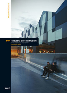
The annual review of Italian architecture is akin to an observation post dedicated by the magazine to small and medium sized projects across the country. The selected works confirm that the themes of infill, reuse, grafting and, more in general, the on-going confrontation with the existing, currently at the heart of the logics underlying the transformation of most European countries, continue to be highly specific to Italy. A way of working that, with the end of the era of great expansions, now turns to maintaining, requalifying, substituting, re-stitching, in a word restoring meaning to urban landscapes under the drive of new socio-economic dynamics, employing particularly interesting and innovative methods. The projects presented on the following pages offer numerous confirmations. In different geographic environments they testify to multiple possible outcomes that begin with a common approach. Particularly significant is the Community Centre in Erba by Ifdesign (16), where the delicate theme of assisting the disabled and a position in a peripheral urban area create the premises for a new space of participation and sharing, moulded from the articulation of diverse functions wrapping around a common space. Also emblematic is the new Relais San Lorenzo (24), situated in the historic centre of Bergamo. Here Natalini and his office have designed an addition to a pre-existing hotel situated in the rocca, confronting the delicate theme of the relationship between new and old in a heavily stratified historic context that also introduced the dimension of archaeology. Other interventions, for example works of infill such as the “La Balena” nursery school in Sinalunga (56) or the conversion of a former warehouse into a new Industrial Research Hub in Reggio Emilia (48), clearly demonstrate that the richness of themes and situations, even the thorniest, represent a resource for creativity and good design.
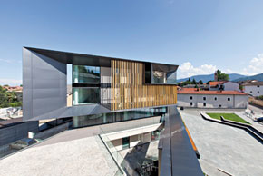 The new headquarters are the product of an addition to the overlooking eighteenth century Palazzo del Fucile, left in a total abandonment until 2005, when it was acquired to be renovated by the bank. The project completes the trapezoidal lot defined by the pre-existing structures and creates a new public square called “of Cooperation”. The entire project is inspired by the pursuit of environmental quality. The exterior spaces work in harmony with the existing; the gate to the fortress is one again given meaning as a privileged element of pedestrian access; the urban furnishings attract people looking for a place to spend time and interact. The square is paved in Luserna stone, typical of the Piedmont region and traditionally employed in local constructions. The design of the external space is instead closely related to the undeniably contemporary and dynamic façade.
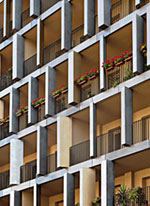 This residential building in Via Maestri Campionesi in Milan is one of the many infill projects used increasingly more often to complete voids in the urban fabric of Italian cities. Inside this residential lot, the Archea team worked to contrast the two adjacent buildings. Their initial focus was on the design of the access to and layout of the ground floor, the first floor and the typology of apartments in the attic, coupled with a particular attention toward redesigning the external façades. In fact, the fulcrum of this project is the pattern of the walls. The plane of the two-dimensional façade is rendered three-dimensional by a markedly vertical development created by the succession of the building’s different levels. The entire composition is fragmented by a series of wedges, of differing forms, colours and dimensions that create visual frames focused toward the interior of the units and telescoping elements framing views of the urban landscape.
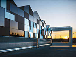 The new NoiVoiLoro community centre, commissioned by an association providing assistance to the disabled for many years, represents a community that, with a spirit of solidarity and entrepreneurship, has created a place where it is possible to support the activities of volunteers: a container that brings together different people with different stories and different needs. The underlying idea behind the project is that of uniting different functions capable of generating the profits required to ensure the organisation’s autonomy. This is why the building consists of very different spaces: areas for use by associations, others dedicated to education and work, recreational spaces and restaurants, all open for collective use. The architects worked with the layout of the building’s functions and their ability to be modified. They imagined a sequence of spaces that fold to create an open and common space, protected from the street in front of the lot.
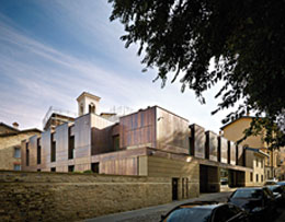 Adolfo Natalini and his office recently completed an addition to the Hotel San Lorenzo in Piazza Nuova – now Piazza Mascheroni – in the Rocca di Bergamo. Completed in 2013, the project dealt with two simultaneously delicate and thorny issues for Italian architecture: the insertion of something new in a historic setting and the relationship with archaeology. The project by Adolfo Natalini satisfies the need for renewal and respect through ongoing dialogue between the new and the existing through form and the redefinition of function. The new building is articulated in section on four different levels resulting from the offset between the level of the lot and the street, though only two are above grade. The entry level is home to the common spaces and a double height space leading to the ruins on the lower level.
 The Elisabeth and Helmut Uhl Foundation is a no-profit organisation created to foster advances in the sciences and the arts through the creation and development of interdisciplinary and intercultural relations. Situated in the mountains of Alto Adige, in the town of Laives, near Bolzano, the building has been inserted within the site with great respect. Its plan retraces the footprint of an existing structure in order to preserve the surrounding environment and avoid occupying additional land. The building consists of two volumes: the home of the Foundation and a small adjacent residential building. The Foundation building is in turn composed of a series of architectural volumes: a transparent glass and steel structure for research activities, another in wood used as a cafeteria-refectory and a lower volume, supporting the other two, containing a wine cellar and reception spaces.
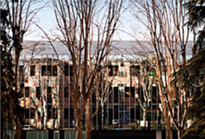 The “Pietro Barilla” Children’s Hospital is a highly specialised healthcare facility that places the needs of children, their physical and mental wellbeing, above all else. The hospital offers a total of 14,000 m2 on four storeys above grade and a basement and approximately 100 beds. The building designed by OBR is an extremely interesting work of architecture, despite the fact that hospitals are subject to numerous limitations. The approach to the design, based on the analysis of medical procedures and an attentive study of criteria of environmental psychology, skilfully unites the needs and functions of a healthcare facility with the necessary conditions of perceptive and psychological comfort. The result is a human-scaled building with an optimum layout.
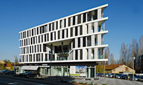 The building called “S12” is part of a urban regeneration plan of an industrial area whose masterplan comes from the collaboration between the dutch architect Jo Coenen and the architectural firm Archisquare. The intervention aims to redesign and recover a whole part of the city located in a consolidated urban area, at the southern edge of the historical centre of Parma. The project area, in its western triangular shaped side, hosts the new building, constituted by a well defined volume divided into two main architectural elements: a platform containing shops and commercial activities and a vertical volume above it with office and service units.
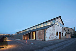 The Reggio Emilia Industrial Research Hub is a reconversion of one of the buildings inside the complex that hosted the Officine Meccaniche Reggiane since 1904. After decades of activity, in recent years the workshops stopped production, leaving the city with a brownfield to requalify. This project, promoted by local government, involved the transformation of one of the large former warehouses into a hub of research, education and experimentation. The project by Andrea Oliva takes its cues from an attitude of respect toward the existing spatial and structural qualities. It interprets their immaterial factors, such as the sounds of the machinery and the movement of workers, looking at the existing through the lens of conservation. The spaces as they have been redesigned appear to be the result of a compromise between functional necessities and the technologies introduced by the new use of the space, and a theatrical mise-en-scène that makes them as visible as possible and ensures they play a leading role.
 Situated in a small medieval centre, this new structure is set into the side of the hill, occupying a large slice of land in a residential fabric. The site was already home to a small elementary school, whose link with the new building will become one of the key themes of the design competition. In specific terms, the project proposes a buffer zone between the two adjacent buildings, composed of public paths and spaces on different levels. It permits the organisation of a space linked with two end points, while ensuring the autonomy of general flows and functions. The nursery school occupies a square hillock on the hillside. A cut into the earth allows the building to merge with the site and become an integrated part of the landscape. The profile of the school’s volumes appears to retrace the slope of the hill, emphasising the growing sequence of nearby structures.
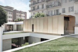 Traveling along Via Capo di Mondo, lined with single-family villini and low-rise apartment blocks, unexpectedly we come across a glass gate that reveals a building constructed in an entirely different language from its neighbours and which intentionally seeks to attract the attention of passers-by. A small illuminated sign tells us that this is the headquarters of Mandragora, a company specialised in the management of bookshops and museum events. In 2008 the company commissioned the architect Claudio Nardi with the design of its new offices on a site formerly occupied by a mechanic’s garage and warehouse. The footprint of the former garage now contains the reception desk and parking, while the former warehouse has been translated into a courtyard space, enriched by the introduction of a small garden surrounded by the large glass walls of the company’s new offices. The system of connections is characterised by a ramp used to re-stitch the fragments of inherited spaces.
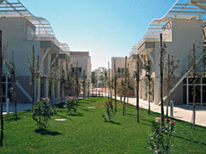 Fregene is one of the important seaside destinations along the Roman litoral. Beginning in the 1970s, the area was witness to a period of exponential growth that was not followed by a contemporary and effective urban planning policy. To date the area remains lop-sided, with excessive settlement towards the seaside and a consequent and progressive structural impoverishment as one moves inland. The project by Giovanni Rebecchini acts in order to reinforce inland areas by creating an urban system in equilibrium between the seaside and the large metropolis. The need to create a given quantity of residential and commercial spaces was immediately transformed by the Roman architect into the possibility to create a new urban centre. A centre situated, not by accident, along the main road linking Fregene with Rome and connected with the seventeenth century monumental pine forest and the seaside.
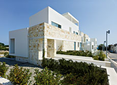 We are in the northern periphery of a small town in Apulia, in the province of Bari, in a historic centre on a rocky outcropping that drops into the sea. A place of extraordinary architecture and landscapes. Only a few hundred metres from the ancient centre is a series of detached and semi-detached villas, homes left incomplete, a general chaos, fragments of dry stone walls, a few solitary trulli overlapping stunning views of the landscape between cliffs and the sea. In this run down part of Southern Italy, in only two years, the architect and contractor managed to realise a high-quality building, attentive to the values of context, capable, without giving into mannerist contextualisation and intelligently reinterpreting the language, materials and typologies of Mediterranean architecture, typical of the extraordinary historic centre of Polignano.
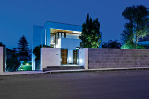 The single-family house echoes the classical model of the Sicilian courtyard dwelling, with one storey above grade and a basement, surrounded by a garden on different levels. The patio serves as a fulcrum and element around which the spaces of the home are organised. It is framed on two sides by a portico and on a third side by the block of the master bedroom; the fourth side is ideally enclosed by the line of a canal that channels water issuing from a spigot on the external wall of the dining. This channel, emphasised by suggestive lighting, follows the level changes of the terrain, between the entry stair and the lava stone retaining wall, terminating in a pool at the entry. The house is one storey, with the exception of a relaxation area accessible from the master bedroom via a stair, and the library-studio overlooking the living room.
ARGOMENTI
– Premi Nazionali di Architettura IN/ARCH ANCE – V edizione – Pag. 90
– Un’Africa concreta in mostra alla Triennale di Milano – Pag. 95
– La Cittadella dei Musei a Cagliari. La manipolazione dei reperti e l’innesto del nuovo – Pag. 98
– Riflessione Adriatica – Pag. 104
– Ascoltare lo spazio: l’esperienza Open Museum Open City al MAXXI – Pag. 108
L’autarchia delle costruzioni – Pag. 110
NOTIZIE – Pag. 118
LIBRI – Pag. 123
CALENDARIO – Pag. 124
Questo post è disponibile anche in: Italian


