Concrete is one of the most widely utilised architectural and building materials in the world. It is the focus of some of the most important experiments and advances in building technologies, from the introduction of the first reinforced concrete structures to the steps made throughout the twentieth century. Experiments that permitted the modernisation of Europe through the realisation of infrastructures and other built works considered milestones in the history of modern architecture. However, concrete, or cement, is also commonly associated with the downside of the speculative expansion of urban areas and territories that has consumed land, caused health problems and polluted the environment. This issue looks at a new season for concrete in the wake of recent advances in its quality and performance made possible by research and the experiments with new languages of design this permits. One important contribution and a drive toward innovation derive from the renewed commitment by cement and concrete companies to increase not only the structural and formal qualities of their products, but above all to modify its properties to diminish greenhouse gases during casting; in particular, the study of new concrete-based products and innovative applications are working to improve air quality, to promote the intelligent use of land and reduce water consumption. The most interesting innovations in this field include so-called “smart concretes”, which can be specifically dosed to be used only where strictly necessary, to help lower the surface temperatures of buildings and, as a consequence, of the air. The advancement of concrete manufacturing and building technologies, in terms of environmental sustainability and recycling, and in relation to new forms, has led to the beginnings of a season of new expressions, represented by the projects in this issue, which present two prevalent lines of research. The first develops an idea of formal beauty inspired by essentiality, sobriety and the absence of ornamentation intended as anything added or overlapped. This is the case, for example, with the visitors centre in Guizhou, China; the summer residences designed by Adamo Faiden Arquitectos in Uruguay; the library on the coast of Beidaihe; the Pioda apartment block in Locarno, similar to a reminder of the simple and elementary principles of good construction. The second line of research, which sets out from the new possibilities offered by processes of modelling and algorithmic calculations, making it possible to create ever freer forms in concrete and cement, is linked to the processes that regulate the evolutionary mechanisms of the natural world, developing continuous organisms in which it becomes impossible to recognise differences between vertical and horizontal planes; they are fused with one another and with the landscapes into which they are inserted. An emblematic example is offered by the Victoria & Albert Museum in Dundee, a building that combines nature and artifice thanks to the use of parametric modelling to create its complex envelope, comprised of 2,466 prefabricated panels and Kengo Kuma’s use of concrete as a malleable material, ideal for expressing his poetic.
BUILDING SPACE WITH MATTER – Pg. 6
Carmen Andriani
A NEW GOLDEN AGE FOR CONCRETE – Pg. 16
Philippe Morel
CLIMATE CHANGE AND ENVIRONMENTAL SUSTAINABILITY: EXPERIMENTS WITH CEMENT AND CONCRETE – Pg. 22
Luigi Mandraccio
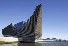
The Scottish home of the Victoria & Albert Museum in Dundee, designed by Kengo Kuma, is more than a museum. It is above all a collective space that belongs to the city, designed to host different events. Part of the plan for the reconversion of the city’s river port into an urban waterfront, the building was designed to resemble a new landscape: an artificial cliff facing the Tay River. The building links nature and artifice by translating the specific characteristics of the Scottish coastline into architectural elements. The reference to the barren cliffs of the North Sea roots the museum in the landscape and makes it an integral part of the cultural identity of its context. The sinuous form of the museum was made possible by a complex structural system that imposed a particular approach to construction which proceeded from exterior to interior. With his project for the V&A Dundee, Kengo Kuma has cancelled architecture as an object and transformed it into an element of the landscape, in which concrete loses its mass and becomes a vibrating diaphragm.
The project serves as a gateway to the subtropical area of Danxia and is inspired by local materials, their use and how they are transported. Water and concrete are the symbolic materials of the building’s lifecycle: water was used to transport the local red stone and it runs through and defines the artificial space in addition of being one of the components of the concrete used to build the roofs. The roofs accompany a series of level changes to create unitary volumes running along the void of a canyon. They create a mountain and literally become part of the landscape. The red bricks of the numerous vertical elements refer back to the forest in their form, density and colour. Comprehensively, the project expresses a vital approach to the construction of space in the present day, in its materials, techniques and forms and their immersion in the cycle of time. It is a process-oriented way of intending architecture and the modification of space, coherent with the intrinsic properties of concrete.
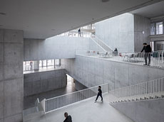
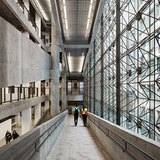
The structural typology of the International Sports Sciences Institute at the University of Lausanne is a direct consequence of the integration between the building’s different functions. The result is a tectonic building comprised of a metaphorically lighter portion, a structural skeleton with external prefabricated columns and a monolithic central organism in exposed cast in situ concrete for common functions. Given the clarity of this composition, the architects progressively controlled both the nature of the concrete mixture and the formwork used to cast it. With the exception of the series of prefabricated columns in the façade and the floor slab above the auditorium, all of the other castings were made using recycled concrete. The smooth and clean surface was obtained using steel formwork and internal plywood panels finished in Bakelite. The formwork system amplifies the effect of a neutral surface, whose rhythm is marked by the inevitable joint lines between panels. The spatial effect sought from the earliest stages of the project is linked to the interaction between the balanced volumes of solids and voids forming the monolith, its surface and its reaction under natural light.
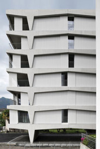
The main idea behind the project is the coincidence between the structural frame and the formal elements of the façade. A concrete structure runs along the entire perimeter of the plan, determining the primary figurative elements of the ‘”face” of the building. The position, form and volume of the building are determined by the morphology of the rectangular lot. The plan, which measures 8.2 x 18.2 metres, features one apartment per floor and a north-south orientation. The cast in situ structure features a load bearing exoskeleton made from two parallel frames set 7.95 metres apart. Each consists of two vertical elements, at 11 metres on centre, that create a central bay. The ends feature a 3 metre cantilever that tapers to create a lighter appearance. The structure, hinged at the base, makes possible to taper the supports at the bearing point, where the moment is very low. Material and form coincide and the diagram of forces becomes the expression of the façade, which is no longer merely the skin of a container. The lines of tension are made concrete in visible matter and take form in an archetypal and muscular structure.
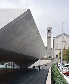
The principal characteristics of this project are the use of reinforced concrete as the primary building material and a layout that links the underground level of an existing building with a new construction containing a pool and gym. The main structures of the restored building consist of load bearing walls with cantilevered beams, while in the addition the structure is comprised of longitudinal piers and coffered ceilings: in both cases, they constitute a continuous mono-material system, the structural skeleton of architecture. The composition of the façades is based on classical tectonic principles defined by the exposure of the structure and the coherence between alignments on the façade and the system of circulation. The new buildings resemble an excavated monoliths, stripped of anything superfluous. Attentively modelled openings bring controlled lighting into hypogeal spaces and help in domesticating the effects of natural light. The renunciation of applied claddings and colour and the praising of material as a gesture of emancipation from the superfluous is the definitive fil rouge that fuses together the new and the restored building, despite the differences in their composition.
The Sesc 24 de maio is a spatial invention that responds to the requests for a highly articulated programme: 25,000 sqm of cultural, recreational and sport activities in a single building. The underlying choice of the project was to develop a multilayer public space inside a container-tower. The entire building is based on the punctiform grid of columns of the pre-existing building and a square cage of four large steel pilotis that run from the foundations to the roof. This cage both reveals and conserves traces of the pre-existing building, in addition of being the organisational heart of the centre. The circulation system of the ramp-street, which rises gradually upward to connect the centre’s different “plazas”, is the second hinge of the architectural concept and the foundation of the horizontal and vertical permeability and “crossability” of the Sesc 24 de Maio.
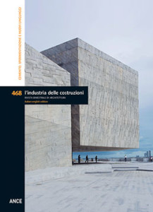
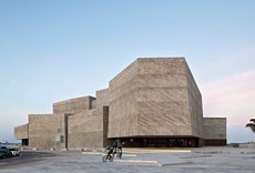
The building resembles a primordial block of stone that was gradually rough-hewed until it reached a dimension proportionate to the scale of its surroundings. To welcome visitors, the volumes at the entry rise up, unfettered by the force of gravity. The first level welcomes visitors into a series of very high spaces: the auditorium is accessed directly from the lobby; this space is surrounded by rehearsal rooms for the choir and musicians, greenrooms, recording rooms, technical spaces, storage and plant rooms distributed over three levels. Given its role as an important urban attractor, the Foro Boca also offers a number of hospitality functions: a restaurant, a cafeteria and a public terrace guarantee the autonomous use of the building beyond the programme of the Philharmonic. Conceptually, the Foro Boca is an attempt to rationalise the maritime landscape through the appropriation of the infrastructural language of quays, wharves and dams. It is an assertive architecture, both solid and unstable, fragmented in its juxtaposition of volumes.
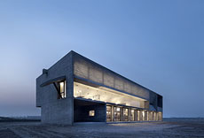
The concept of the library on the beach in Beidaihe is based on a merging of different functions and a continuity between the interiors and the beach. The stepped space of the reading room was designed to establish a material dialogue between the piers and the curving extrados of the ceiling, the furniture, the floors, the bamboo seating and the walls facing the sea. This latter element has been stripped of any structural value by the insertion of a steel truss supporting the concrete roof, concealed inside a glass bricks wall hovering above a glass wall between the inside and the beach. Spatial quality is closely linked to the finish studied for the concrete surfaces. Natural light, above all during the morning hours, emphasises the sense of this large carved monolith: with this objective in mind, Gong Dong used a rough formwork. Rather than pursuing a regular pattern , he focused on exalting imperfection.
This project stands out for its immersion in a natural setting and for the use of exposed concrete, plastically modelled to emphasise its expressive potential. Adamo-Faiden have focused on the expressive qualities of this material. Concrete was selected as the material that best matches the atmosphere of the natural setting. However, it is not a concealed skeleton but a continuous surface, similar to liquid stone that gives form to volumes. There is no homage to technology in this project, but instead a graphic use of abstract surfaces that come together to define essential volumes. The use of in situ mixed concrete cast in traditional wooden formworks creates a vertical pattern that exposes all the roughness and hand-crafted qualities of construction. The vertical positioning of the forming boards creates bands of the same width whose rhythm is used to control the design of the elevations. The layering of this pattern governs the appearance of the façades and the position of openings. The housing system is based on the repetition of two residential typologies, which differ in form and size. It is an open design, based on an expandable model and designed to be built in different phases.
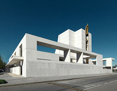
In an heterogeneous urban fabric, in some parts cluttered with industrial buildings without identity, stands the new church of S. Ambrogio in Trezzano sul Naviglio. The Church and community center establishes a renewed relationship with the urban environment, but also with the canal on which it faces with an effective side elevation. Long beams define the volume of the community center. with wide rectangular frames disclosing the view to the open spaces inside the religious complex, while the sail that covers the apse of the liturgical hall draws a curve that climbs towards the sky. This white curved surface makes the church resemble a ship that slowly goes up the canal. The designers of Quattroassociati have chosen concrete as a the main material to define the structure and form of this architecture. Cantilevers are placed on the façade to bound the voids and to support scenographic hanging volumes.
ARGOMENTI
– La luce come materiale del progetto. Il Louvre di Abu Dhabi di Jean Nouvel – Pag. 108
– La qualità emergente. Architetture recenti in Sardegna – Pag. 114
– Mario Radice: il pittore e gli architetti. Una mostra alla pinacoteca di Como – Pag. 118
LIBRI – Pag. 123
NOTIZIE – Pag. 124
Questo post è disponibile anche in: Italian


