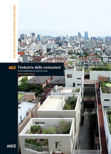
In 2014, Korea was awarded the prestigious Golden Lion for its pavilion “Crow’s Eye View: the Korean Peninsula” at the Venice Biennale curated by Rem Koolhaas This important recognition marked the beginning of a new phase of international attention toward this Asian country, sanctioned also by other exhibitions and initiatives emphasising the importance of contemporary architecture in South Korea. Each of these exhibitions, though in particular that in Rome, provided diverse reasons for an interest that, despite geographic and cultural distances, sheds light on how South Korea can serve as an example for Italy. This conviction led to the decision to dedicate this issue of the magazine to the research and buildings of a group of Korean architects. One of these reasons lies in the value attributed to architecture as a driver of social, cultural and economic development. This is well-represented by the architects selected. Notwithstanding their different architectural languages, this group of professionals promotes an approach to architecture and urban design that differs from that suggested by the star system and its most recent icons. Architecture was seen as a fundamental political instrument not only for the country’s growth, but also for defining the direction to be taken by a nation searching for its cultural position in a gloabalised world. The group of architects whose work is presented here exploited the period of separation afforded by time spent studying abroad and a greater freedom than that allowed the previous generation. Their work is characterised by the sobriety typical of the best examples of Asian architecture and, at the same time, possesses the ability to absorb the complexity, contradictions and changes occurring in the contemporary Korean city and society. Their projects are the result of a way of designing that, by uniting a sense of reality with a particular study of the spatial and material qualities of architecture, successfully interprets a fundamental element of the urban morphology of Asian cities: density. This element is translated it into an effective, original and never monotonous language. In each project by these architects, the theme of density triggers a reconsideration of the relations between building and urban space, between interior and exterior, between private and public. Their attention concentrates on the relations between parts and the formal configuration of elements and spaces in a state of transition. Elements that play a leading role in a new dimension of architecture that is inclusive and open to new uses and heightens the involvement of the community.
ARCHITECTURE AS THE RENAISSANCE OF IDENTITY. THE EXAMPLE OF SOUTH-KOREA – Pg. 6
Luca Galofaro
A LONG-DISTANCE CONVERSATION BETWEEN ROME AND SEOUL – Pag. 12
Luca Galofaro
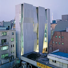 Despite rising seven storeys above ground, this building does not stand out for its size, but instead for the spatial inventiveness of its façades, which transform built form into narrative. Imagined by Yoon Gyoo Jang, founder of Unsangdong Architects, as enormous “urban canvases”, the sloping concrete planes of the building envelope communicate the presence of a new space for experimental art in a dense context of creativity. To create a work of architecture that would be an active part of this context, the skin of the building is transformed into a device of spatial generation and interaction. The expressive two-dimensionality of this canvas is conceptually and physically deformed to create a three-dimensional scenario. The folded walls of the envelope generate sectional voids articulated as internal and external spaces. The conquest of the multiple layers concealed behind this single plane occurs in parallel linear bands, based on a simple underlying geometry. The synthesis of this process is summarised in the concept of the “skinscape” used by the architects to describe the combination between the notion of architectural envelope and the wider notion of landscape.
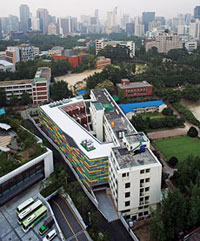 Ewha is one of the oldest girls’ schools in Korea and one of the most prestigious in all of Asia. This project by KYWC Architects involved the main historic building of the school, founded at the end of the nineteenth century in the Jung district of Seoul’s old town centre. The renovation of the “Scranton Building” included the substitution of a portion of service spaces (storage and technical rooms) with a Vision Centre. The form of the spaces for these new activities is a C-shaped extension with different-length wings attached to the body of the existing building to create an internal courtyard. The 10,000 sqm Vision Centre sits on an articulated and irregular site. The basement directly beneath the courtyard, in addition to providing a second level of technical rooms and service spaces, also hosts an assembly hall and audio visual projection room that, together with the large cafeteria on the ground floor, complete the programme of collective activities. The ground floor programme includes: art classrooms, computer rooms and small lecture rooms.
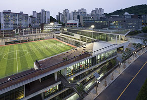 This project is the result of a 2008 competition that presented an arduous challenge: the location of the Student Union on a narrow lot between the tribune of a small playing field and a series of very tall buildings, with a 12 metre level change between interior and exterior. The winning proposal from the team headed by Moongyu Choi is based on a system of connections that rises up along the edge of the playing field at -12 metres and emerges from the ground as a projection that takes the form of a building and landscaped-public space.The project is generated by excavations and crossings that begin with the flow passing from the campus entrance to the central plaza. It then turns back on itself to become a volume that drops down six levels.
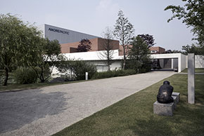 Designed by the architect Kim Jong-Kyu, founder of M.A.R.U., this complex showcases the values associated with the brand. The result is a work of minimalist architecture with clean and elegant lines, uniformly flooded by natural light. Materials (exposed concrete, steel, brick and glass) and forms mirror the idea of clarity and efficiency expressed in functional spaces, defining a sense of a greater openness and sophistication, and an intense relationship with the landscape. The refined dualism between functionality and aesthetics is echoed in the use and management of spaces: more than spaces of meditation, they are also technical spaces of production, a botanical garden, a modern oriental take on the Giardino dei Semplici, is used by AMOREPACIFIC to grow some of the botanical ingredients used in its products; it contains more than one thousand species, subdivided by ecological characteristics.
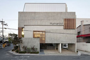 Despite the small size of the lot (325 sqm), the need to build at least 1,000 sqm of floor area resulted in a volume with a series of carefully calibrated voids at ground floor and the overall image of a simple solid concrete prism. The compactness of the front elevation and that adjacent to it suggests a building with a certain weight. However, after turning the corner it immediately reveals a second nature. The building is carved out by a large central void; an opening and welcoming heart, full of life, a space for different activities and social interaction that reinforces the connections between interior and exterior. Its surface folds down in a continuous line to two rooms in the basement. This downward movement establishes a fluid tension with new points of interest that extend the street into the core of the building. The ground floor features a small parking area, a café and a stepped ramp in wood: an open and protected space directly linked with the city.
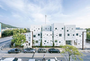 In the surreal urban landscape of Paju Bookcity, the wide district dedicated entirely to the world of publishing, UnSangDong Architects designed this kindergarten whose form results from the spatial mutation of a three-dimensional geometric matrix. The primary unit is a cube based on the golden section. The trigger for the entire design comes from imagining the kindergarten like a “blank sheet”, a space where children create their dreams and develop their fantasies. The base cell is modified and transformed into different external spaces; courtyards, terraces, outdoor play areas that penetrate one another and meld with the school’s interior spaces. They emerge like the wrapper of a void created by adding and subtracting surfaces from the faces of solids belonging to the original cubic Matrix.
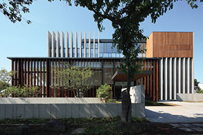 The Jung Clinic, completed in 2014, is an elegant building designed by KYWC Architects on the island of Jieu-si, in Southern Korea. Situated in the pulsating heart of the city, this private clinic occupies a corner lot, with two sides fronting primary traffic arteries. The building is set back from the street and the relations it establishes with its surroundings are primarily visual, framing perspective views of parts of the city. At the two entrances, to the south and west, two artificial gardens of water, wood, stone and grass, create filters between the clinic and the city and offer open public spaces. This mixture between public and private clearly emerges in the layout of the ground floor, where the gardens flow in and out of volumes open to the city.
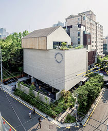 The Queenmama Market occupies a corner lot of slightly more than 600 sqm, between Dosan Park and the irregular fabric of commercial buildings and narrow alleys of the Gangnam district. This edge condition was astutely perceived by Cho Byoung-soo (BCHO architects) as the possibility for a meeting between the nature and the city. The architects developed a close-knit layout set back from the street, leaving approximately 50% of the site free. This move, as effective as it was simple, allowed for the ideal extension of the park’s vegetation into a strip of flowers along the east edge and a garden of trees and ferns to the north. This marks the point of access to the market building, a compact 14.5 x 23 metres concrete parallelepiped raised above the ground. With no windows facing the city, this volume opens up generously toward the park through a series of deep terraces and full height windows that consolidate the relationship between architecture and nature. The complex is completed by a rooftop structure with a gable roof. Set slightly off axis with respect to the roof of the market building, it hosts a small café fronted by a large terrace offering views over the city.
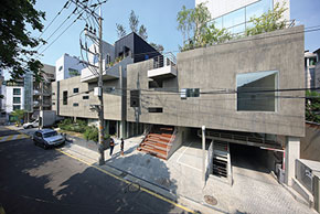 The ZWKM building is located in Seoul’s Gangnam district. The architects were asked to design four independent buildings for four different companies on a 1600 sqm lot. Their proposal for a single building, imagined as a layering of four different programmes, proved to be a highly successful experiment.The project works with the concept of “Collective Form” tested by the office in other contexts: a system for the coexistence between different buildings founded on shared principles.This is not the result of the simple overlapping of blocks but instead an idea of connecting different lots using horizontal paths, layered on different levels, with specific strategies and principles of circulation for each level.The spaces of connection between blocks – gardens, rest areas, semi-private spaces, etc. – become the key elements of an urban palimpsest whose identity is defined by architecture.
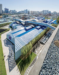 The F in the name of this project – “F1963” – stands for Factory, while the number defines its temporal horizon: the factory was built in 1963 and decommissioned in 2008. “We can consider this the ‘architecture of a new cycle’, a creative reinterpretation of objects from the past that maintain unique traces of memory and time, rather than rigid conservation or nostalgic reconstruction” (text by the architects). F1963 develops this concept of the “new cycle” through three distinct actions. Conservation, intended as the use of existing architectural elements and evidence of the past; subtraction, including the creation of a new internal courtyard and the demolition of existing walls substituted by a new glazed façade on the entrance side; addition, by externally offsetting the profile of the main elevation to create an interstitial space finished in sky blue expanded metal mesh.F1963 is an industrial site of almost 2 hectares, approximately half of which is covered by warehouses. This vast horizontal field becomes a matrix of emotions, a living substance that recovers the material signs and emblematic character of the site. The sky blue colour of a waterproofing membrane, a common finish on roofs throughout Busan and many other Korean cities, is creatively reinterpreted.
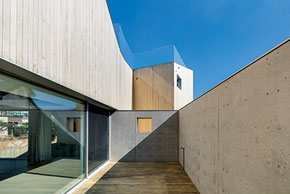 The House of 20,000 Books sits within a dense fabric of single-family homes The last unoccupied lot in the area, the site is closed toward the south and west by homes built along the lot line, while to the north it is flanked by a busy street. This context imposed inevitable restrictions on the project, heightened by stringent building regulations governing heights and roof gables. Minsuk Cho responded to this architectural brain teaser by developing a highly introverted project comprised of two rectangular base volumes with single gables along the short sides of the site, connected by a central circulation volume that defines two internal courts. The compactness of the entire project is guaranteed by the cladding of the façades in wood slats that extend into a tall fence. Inside this shell, which guarantees privacy and calmness, family life coexists with the expansive collection of books possessed by the client, a professor, in the form of a promenade with evident references to the work of Le Corbusier.
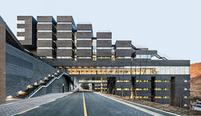 This student housing building at Daejeon University was designed for a sloping site in the city of Daejeon. The project is the result of the aggregation of simple volumes to form a large block finished in brown brick. A system of ribbon-like cuts scratches the surface of this large unified block, with a system of vertical cuts juxtaposed against horizontal windows. The block is divided into two parts by a continuous glass surface and crossed by a street linking the project with other parts of the campus.The colour at the entrance matches that of the ground. It seems to speak of an intention to make the impact of passing between interior and exterior as delicate as possible. The other walls at the entrance are grey with light-coloured paving interrupted by black strips. The project works with light, opting for contrast and elements to be exalted; light plays a fundamental role at all levels. It is used like a building material.
ARGOMENTI
– Duilio Cambellotti poliedrico artista romano – Pag. 112
– Tra rigenerazione urbana e sostenibilità ambientale. Il nuovo approccio alla pianificazione del Piano operativo di Prato – Pag. 117
– Fabrizio Carola. Il ruolo sociale della tecnologia per l’architettura – Pag. 120
LIBRI – Pag. 124
INDICE 2018 – Pag. 125
Questo post è disponibile anche in: Italian


