Only slightly smaller than the territories of Rome or New York, Hong Kong is known for its incredible density owing to the concentration of urban settlement in a mere 13% of its vast dimensions. A hilly and mountainous topography has made it the “the most vertical city on the planet, adorned by more than 1,300 skyscrapers and an astounding skyline”. Hong Kong’s particularity is the fruit of various factors, often highly contradictory: on the one hand its physical and geographical conditions and, on the other, the encounter between two very different cultures – East and West – whose alternation over time has created one of the world’s most unique figurative scenarios. This uniqueness is a source of never ending surprise and, precisely due to its twofold register, the conveyor of a form of urban growth marked by the coexistence between the model of the most audacious and surprising skyscrapers and the renewal and regeneration of existing sites and buildings. Its condition as an anomalous Chinese city, a result of its history and particular ties with Europe has, in recent years, led the Hong Kong government to implement a process of cultural development focused not only on its commercial attractiveness, but also on attracting cultural tourism through the valorisation of historic sites. The projects selected for this issue reflect the results of a political intention that, by identifying the city as the most suitable location for advancing knowledge, identity and culture, orients real estate investment programmes toward the transformation and recovery of existing building stock. Evidence of a new interest in Hong Kong toward history and culture can be found in recent projects for the adaptive reuse of ancient and more modern structures. Examples include the transformation of a former British Navy munitions depot into the new home of the Asia Society Hong Kong Center. A different example is offered by the very central and spectacular Kai Tak Airport, constructed atop an artificial island at the centre of Hong Kong Bay.
THE SHOULDER OF ORION – Pg. 4
Aldo Aymonino
HONG KONG REGENERATES HONG KONG. RECENT POLICIES FOR METROPOLITAN DEVELOPMENT – Pg. 16
Gianluigi Mondaini
EIGHT QUESTIONS TO ROCCO YIM – ROCCO DESIGN ARCHITECTS – Pg. 28
Interview by Paolo Bonvini and Gianluigi Mondaini
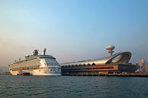 In 2010 Foster and Partners studio was awarded the international competition for the construction of the new “gateway” to Victoria Harbour. The building occupies the end portion of what was once runway 13. The terminal can host two 360-meter long cruise ships and more than 6,000 passengers and crew, with the ability to move 3,000 passengers an hour. Length wins out over width. The structure is 850 meters long and only 70 metres wide. This urban megastructure is three storeys high and culminates in a pedestrian walkway on the roof, open to the city. In addition to boarding areas and waiting rooms, the building also contains the car loading/unloading ramps. Spaces used by passengers in transit were carefully studied to guarantee easy orientation and movement. All the same, the new cruise terminal has also become a new centre in the city.
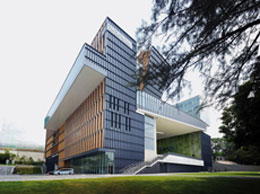 The Chu Hai College of Higher Education was built atop existing foundations, realised for the project by the Dutch office OMA. Rocco Yim, working in collaboration with Arup, developed his project based on the status of this previous project, with an eye on cost savings. The building consists primarily of a large podium at ground floor and two large parallelepipeds facing one another and connected by bridges. At the centre of the complex is a large plaza that offers an incredible view toward the ocean, emphasised by the large south-west bridge that creates a frame that exalts the surrounding natural context. The result is a successful high-density composition of volumes that hosts some 4,000 people – students and academic and administrative staff – in a total of 26,500 square meters.
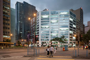 This retrofit by MVRDV of this former industrial building in Wai Yip Street 133, on the waterfront in Kwun Tong, Hong Kong, is part of a wider urban transformation and development plan focused on converting the post-industrial district of East Kowloon into a new business hub for the city known as “CBD2”. Commissioned in 2013 by the international real estate company GAW Capital, the project is currently one of the most important to have been completed in East Kowloon, establishing a bridge between the area’s industrial roots and its metropolitan future. The project provides a total of 18,000 square meters of office and commercial area and restaurants.Ground floor shops generate a relationship with the surrounding urban fabric. A large entry hall is characterised by an imposing light sculpture. The central floors are all used as offices, which can be subdivided by glass partitions into multiple units as required.
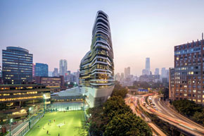 This 15-storey tower stands out for the plasticity of its fluid lines inside the campus of the Hong Kong Polytechnic University. The tower’s 15,000 square meters are home to the Hong Kong Polytechnic University School of Design and the Jockey Club Design Institute for Social Innovation. The building is an articulated collection of design studios, workshops and ateliers, exhibition spaces, multipurpose rooms and lecture halls, all organised around patios and common areas for informal activities. Internal circulation mediates between spaces designed for classroom lessons and environments more suitable to multidisciplinary activities. A large ramp inserted in a central void represents the hinge of the composition, overlooked by the balconies connecting the classrooms.
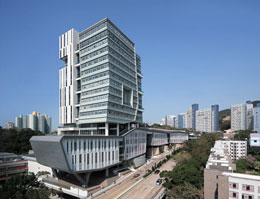 The City University of Hong Kong has built a new educational and administrative building at its Kowloon Campus, designed by the architect Ronald Lu in 2013. The new structure includes classrooms, teaching and research labs, multipurpose rooms, common areas, administrative offices, a large lecture hall, a cafeteria and a hanging garden. Four fundamental principles guided the articulation of the project in relation to the characteristics of the site: the creation of a strong connection between the complex of dormitories situated atop the hill and the main campus below; the realisation of a hanging garden crossing the site like a sloping bridge in order to re-establish a relationship with the existing landscaping; raising the ground floor to improve the permeability and the fruition of natural environment at street level thus guaranteeing continuity; orienting the building in relation to Hong Kong’s famous Lion Rock hill.
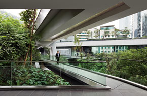 Inaugurated in 2012, the new Center is situated on a sloping site that once hosted four military buildings erected by the British Army in the mid-nineteenth century for the production and Storage of explosives and munitions. At the beginning of the twentieth century, the site was expanded by the Royal Navy only to be abandoned in the 1990s, when the Hong Kong government transferred it to the Asia Society. The abandoned site was the object of an international design competition in 2001 for the new center, with the objective of preserving the historic buildings and adapting them to new uses. The winning project by Williams and Tsien has created a lively cultural center for researchers, seminars, lectures, a host of cultural programmes, art exhibitions, performances and films. It is a combination of conservation, adaptive reuse and new construction.
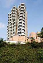 Gehry has left his mark on Hong Kong with this luxury apartments tower offering breath-taking views of the city and harbour. The project was designed for Swire Properties, a large local real estate group. The tower rises up from an almost impossible site, because it is practically unoccupied, on the slopes of Mount Cameron. Opus Apartments is a compendium of Gehry’s approach to design and invention and a selection of themes from his research, of which the tower represents an evolution.The Opus Apartments are rife with references to the natural world. Gehry has referred to the base as “the quarry”, a name that explains the stepping conformation and cubic forms of the blocks of the two duplex apartments. The twisted and curving columns, exposed on the façade, resemble reeds gently swayed by the wind, though with a structural function. Finally, Gehry has compared the form of the apartments to a flower, where the petals opening outward from the stem are individual domestic environments. Each has their own forms, dimensions and projections, and each is slightly different from the next as the building rises upward, offering characteristic views of the landscape.
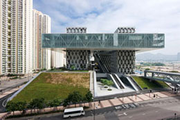 The new Institute for Design, dimensioned to host about 4,000 students, has been designed as a new urban centrality for the entire district and a potential generator of new categories of users. The layout determines the creation of public spaces and various facilities. The connection to the ground, resolved by a podium, is in fact modelled to define spaces suitable to social interaction, differentiated in scale and by specific elements. The result is a large urban space able to favour meetings and exchanges, allowing a direct connection with the urban area and other public sites.The project consists of a podium, two prismatic volumes and a suspended plate wedged into the two volumes.
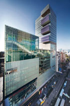 The complex stands out for the lightness and elegance of its volumes, for its ability to read and interpret context, while being fully aware of the strategic need for the iconic. Rocco Design proposed a new take on the shopping mall of the recent past, introducing transparent surfaces in lieu of the once opaque walls of monolithic volumes. Large mute boxes are reimagined in relation to “dynamicity” and “transparency” as the watchwords for the reinvention of this typology. Rocco Yim channels the frenetic energy running through the streets of Tsim Sha Tsui into his building, reformulating commercial space into a new and decidedly more attractive typology. He opposes transparency to the opacity of the anti-city to exalt the flows and vertigo of the city, skilfully overlapping a series of transparent volumes to reveal the movements of users. The articulated geometry of the complex is composed of three different parts: a shared podium and two vertical volumes. The first, a corner volume, is characterised by overlapping boxes. It reveals and expresses the heights of the surrounding volumes through an optimum capacity to relate to context. The taller second volume emphasises the project’s role in the vertical growth of this vital new urban centre.
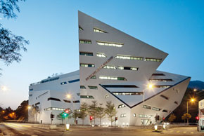 The Run Run Shaw Creative Media Centre is part of the City University of Hong Kong. It was realised in 2008 by the architect Daniel Libeskind in collaboration with Arup, responsible for the structural, civil, mechanical and electrical engineering. The building offers a total of 24,600 square meters and contains two sound stages, a multipurpose theatre, recording spaces, a television studio, computer workshops, classrooms and research spaces, flexible spaces for events and exhibitions, three lecture halls, an electronics laboratory, a wood and a metal shop, an immersive VR lab, three screening rooms, two of which are THX certified, a restaurant and a bar. The Creative Media Centre hosts 2,000 students and 500 teaching and technical staff. Students are trained in disciplines ranging from computer science to the fine arts, from visual design to creative writing, from cultural studies to digital technologies.
ARGOMENTI
– La Piazza del Vento a Genova – Pag. 106
– Invenzione e destino della palazzina romana – Pag. 110
NOTIZIE – Pag. 116
LIBRI – Pag. 120
PANTOGRAFO – Pag. 121
.


