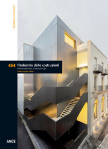
This ninth review of Italian architecture confirms a number of themes revealed in two of its predecessors (cf. n. 440 November-December 2014 and n. 450 July-August 2016). They can now be considered constants characterising the activities transforming the Peninsula. The themes of building substitution and infill, the expansion of the dialogue between old and new, reuse and the definition of new public spaces and spaces of shared social activities, now dominate at the small and medium scale. At the scale of the landscape issues related to the promotion and care for vast areas with an agricultural or natural vocation require architects to search for new and suitable strategies of intervention. The landscape-cultural route in Virgilio, in the Mincio Park in Mantua, designed by Archiplan Studio, fully subscribes to this search, with the objective of highlighting the historic-environmental peculiarities of its natural setting, through a well structured system of specific and discrete architectural elements. This 4 kilometre long “literary path” establishes a long-distance dialogue with the poet Virgil as the narrative atop which to construct an original telling of the anthropic, cultural and landscape values of the area through which the lower Mincio River flows. The landscape is once again the protagonist at the Pizzolato Winery in Villorba by Made associati. Its colours, materials and agricultural patterns offered the architects precious suggestions, which they translated into a minimalist language that unites a propensity for refined formal research with an intelligent experiment in construction that uses the new to interpret the richness of the Treviso landscape. An attention toward architecture aimed at creating charged spatial relations that support the concept of community and social interaction through the creation of places of meaning, rather than formally self-referential objects, informs the projects for the Comunità nuova Hub in Milan, the Citadel of Knowledge and Culture in Bologna and the Gymnasium and Climbing Centre in Brunico. The controversial question of how to insert the new into consolidated contexts is intelligently and skilfully confronted by Fabricanove in their project for the New Auditorium at San Cataldo, and by Iotti+Pavarani in their Regina Pacis Parish Centre in Reggio Emilia.
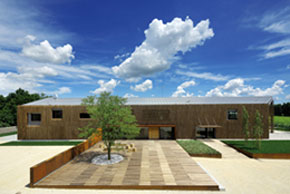 The landscape of Treviso, with its fabrics, material compositions, interconnected patterns and colours plays a leading role in this project by MADE. The agrarian landscape, made of regular rows of vineyards and poplar trees, constitutes the natural backdrop to the design of this wine cellar. However, the tie between new architecture and context is more than simply visual. The contents, forms and methods of organisation are found in the structure of the new building. They enter inside it, to make the spaces of the cellars and those of the site a one-of-a-kind unicum. The primary material is beech wood used both inside and outside. The use of a natural material like wood is inserted within the agricultural landscape, recalling analogies of colour, material and times of aging.
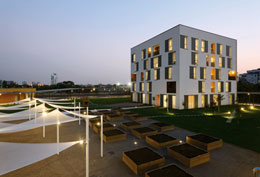 The Centre is broken down into four independent blocks: multipurpose spaces located inside an articulated volume containing flexible rooms, services, a kitchen, storage, change rooms, a reception area, coat check and meeting rooms with office archives; the educational community and temporary housing inside a five-storey plus half-basement parallelepiped. The third block is occupied by workshops, conceived as spaces and services for the entire neighbourhood, covered by a large single pitch roof. The final block is occupied by the offices, positioned outside the porticoed ring and organised by spaces illuminated by small internal patios. The most characteristic element of the entire project is the aforementioned porticoed ring. This permeable element ensures the fundamental visual and audio interactions that allow the community a dynamic and anything but banal connection with the surrounding environment.
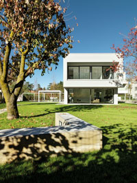
This project by Liverani/Molteni employs very basic compositions and an archaic essentiality coupled with a contemporary minimalism. The Nanni House takes form within this artificial white landscape. It is one of the recently completed homes dotting the margins of the area surrounding three centrally positioned multi-family homes. The villa sits in a private park, in which a stone path defines the artificial space occupied by its pure volume. This monolithic parallelepiped stands in the space of the garden; the only exception to the purity of the volume is conceded to a cantilever on the short side facing the garden, offering shade to the window of the ground floor living room and creating a loggia on the first floor. The modulation of natural light is also used in the design of the exterior spaces, where the volume is accompanied by a pergola. This elementary geometry creates the plans and elevations of the house: a rectangle containing the living spaces at ground floor and the bedrooms on the upper level. The long sides compress and isolate the house from its surroundings, with hermetic façades made from thick masonry. The walls are an assembly of external thermal insulating, a concrete load bearing structure and an internal gypsum board wall. Contrary to this construction, the short walls are fully glazed.
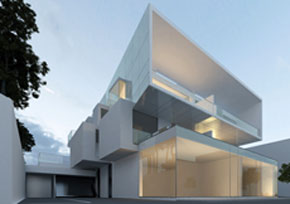 The via Gramsci multipurpose building substitutes an existing construction in an area close to the historic centre of the city of Giulianova. The idea was to create an artificial ground plane raised above the road atop which the volume of the apartments floats. This solution clearly identifies the different parts of the building and allows for the creation of an east elevation with a large terrace facing the sea. The block of apartments, set against the north lot edge, thus manages to frame the existing view though the buildings to the east. A view that offers a glimpse of the horizon. To the south, the area overlooks the garden of one of the city’s historic villas, often in the shade cast by the long shadows of tall pine trees. The project opens up, the building flexes and projects volumes and views toward the exterior; large glazed openings draw fragments of the landscape inside the apartments. The materials are simple: plaster (for all of the elevations) and glass (for the parapets).
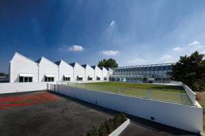 The Opificio is home to the Golinelli Foundation, created in 1988 by the pharmaceutical entrepreneur and philanthropist Marino Golinelli to promote a culture of science among young students, favouring an informed approach to the choice of higher education and employment: from interactive workshops for children from kindergarten to elementary school, to fully equipped science labs for high school students, with spaces for courses and lectures open to teaching staff. This highly variegated programme of activities led the architects to imagine a collection of flexible spaces, characterised by a playful image that would be attractive to young users. The Opificio is a renewal of the Sabiem Steel Mills, decommissioned in 2008. Inside the two adjacent buildings the steel trusses of the roof were conserved, restored and painted white, while the rest of the spaces were freed up. A series of specific interventions proposed by the project maintain the industrial appearance of the site.).
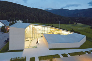 The building designed by Stifter + Bachmann is immediately recognisable and conceived as a succession of adjoining and rotated buildings. They define a ring with a broken geometry, open on one side and organised around a central courtyard, the fulcrum of the composition and a space of connection between a new parking area and the gymnasium. The articulation of the volumes, differentiated in height and depth, responds to a functional programme that called for the distinction between an exterior area for climbing activities and three different types of interior gyms. Beginning with the maximum height of the external climbing area, the roof of the volumes folds progressively toward the “bouldering” section, where a lower height offers those arriving from the parking area a view of the surrounding landscape.
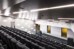 Distinguished by substantially two elements – a façade and the monolithic block of the auditorium – the building was designed to meet two needs: on the one hand functional, creating a space the bank could use for corporate gatherings, also open to local citizens for events and cultural initiatives; on the other hand architectural and regulatory, involving the reconstruction of an existing late nineteenth century façade, which had collapsed due to structural settlements. The new volume, a large block finished in vertical anthracite wood fibre and resin panels, hides behind the other, lighter coloured façade, emerging above it to generate a significant chromatic and linguistic contrast. This contrast continues inside where the black blocks of furnishings and vertical connections exalt the white surfaces of the building envelope. The auditorium occupies a total of 1,300 sqm, on four levels, plus a half basement housing the technical rooms and an archive.
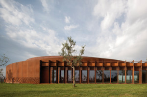 Milesi & Archos, working with the Bertarelli Foundation, designed this 300-seat concert hall which seeks, and finds, a critical dialogue with the natural context, while respecting the typical approach to settlement in the inland areas of the Maremma. The project pushes design decisions to their extreme. More than a building, it is a volume, artificial in its form and terribly natural in its material qualities. The Forum is reached on foot, walking up a hill and crossing an olive grove that surrounds the western, southern and eastern edges. To the north, a copse of maritime pines serves as a natural landmark. The concert hall, with its curving form, serves to generate a long curving wall in cor-ten steel that guides visitors from the landscape into the foyer.
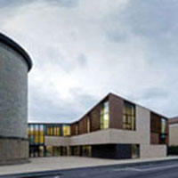 The Regina Pacis Parish Centre in Reggio Emilia is a hub in the first periphery to the south-west of the Emilian city. The architects were asked to modernise an existing parish house and to add a new centre for the community, demolishing an old cinema, to be replaced with a new building that would house a multipurpose hall and classrooms for catechism and parish activities. The new building was also to establish a connection between the street front and the parish playing fields behind it. the project for the new Regina Pacis Parish Centre modelled a void between the new construction and the apse of the church: a street front piazza for the neighbourhood – a second church square – that protects the entrance of the new building, situated in the long wing connecting it with the existing parish house. Designed by Iotti+Pavarani, the L shaped building wraps this central space, adopting a similar height to the church and tracing the alignments of the parish house and lot.
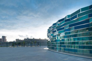 In 2004 the competition for the New Hospital for Eastern Naples, the “Ospedale del Mare”, involved a large medical complex, divided in two lots by the Circumvesuviana railway. IaN+ presented two buildings in their competition submission: a space for the reception areas, the entry Hall, and another for the layout of the interior circulation, a large tree suspended above the internal courtyard and connecting the various parts of the hospital. To complete the project, in 2014, IaN+ also designed the pedestrian plaza along Viale delle Metamorfosi and the road and landscaping systems around the hospital perimeter. A large and multi-coloured cylindrical volume rises up three levels: inside, floors slabs perforated by large openings and circular skylights create a luminous and rarefied atmosphere. Oblique light invades the large central hall, which develops on different levels, and reflects in the glazed interior partitions framing the different spaces. An indoor garden inserted inside an impressive double truncated cone penetrates the two levels of the building with the strength of light and void.
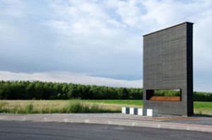 Archiplan’s project for the Virgiliano del Mincio Regional Park is a four kilometre long “itinerary for reading” history, culture and landscape, designed to exalt the territory of the lower Mincio River. In addition to establishing an original and interesting dialogue with its natural setting, the path proposes a long-distance conversation with the poet Virgil through a discourse that unites history, poetry, architecture and nature within the flow of a single, big story. The project consists of a series of lightweight structures, similar to territorial landmarks that define a rhythm for the bicycle-pedestrian path along the riverbank. They are “portals of knowledge” in the landscape, each organised with a system of seating and diversified according to the site on which they are erected. The constructions all share the same palette of materials, from cor-ten steel to river gravel, to various types of wood and exposed concrete.
ARGOMENTI
– Il Nuovo Museo della Zecca di Roma- Pag. 80
– Il quartiere popolare Sant’Elia a Cagliari. Costruzione, degrado e riqualificazione paesaggistica di una periferia – Pag. 86
– Convegno In/Arch-ANCE a Milano. Riqualificare la città attraverso gli scali ferroviari – Pag. 90
– Mobilità sostenibile: un collegamento polifunzionale nella Valle dell’Aterno – Pag. 92
– Architettura coreana: una mostra a Roma – Pag. 94
– I jardines elevados de Sants a Barcellona. Un’infrastruttura contemporanea – Pag. 98
LIBRI – Pag. 103
NOTIZIE – Pag. 106
INDICE 2016 – Pag. 111
PANTOGRAFO – Pag. 115


