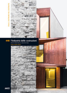
The city grows by expansion and at the same time by building atop itself, through additions, insertions and overlaps; this process has regulated its development throughout history. The method of urban evolution typical of every era is once again a the centre of architectural debate, as a consequence of an inversion in social and economic dynamics that, little more than a decade ago, were based on the growth of populations and settlements. Today, in light of environmental issues, the defense of land and the scarce availability of economic resources, architecture operates in accordance with a logic of re-stitching and minute insertions within the existing. In accordance with this logic, the international contribution made by Italian architecture, as pointed out by Cino Zucchi during the last Venice Biennale of Architecture, has become particularly significant as the attention and ability to intervene is not limited solely to the reuse and enlargement of buildings in historic areas, but has now expanded to include interesting solutions of grafting and the regeneration of urban voids under the most disparate conditions. This issue of the magazine offers a selection of these projects that differ in their location, strategy and the choices adopted by their designers, though all are animated by a highly pragmatic sprit that demonstrates a stimulating inventiveness and architectural results of notable quality. We begin with the “Città del Sole” (City of the Sun), a complex of apartments and shops by Labics, The project moves beyond the slavish re-stitching of the numerous pre-existing elements that surround it to define a permeable urban edge. In Bari, Netti Architetti and Simeone Piloni have designed an apartment building that substitutes a previous construction within the urban grid designed by Gimma in 1812. The Bailo Museum in Treviso, designed by Studiomas and Heinz Tesar , is instead inserted in the historic site of a fourteenth century convent in a gesture of sober and elegant exaltation of the new. Finally, the Rehabilitation Centre in Porta Potenza Picena, by Archea Associati: the architecture of the new pavilion assumes a particular value in the relationship with its context, using sophisticated solutions to protect the delicate condition of recovering patients without isolating them from the exterior world.
RENOVATING THE URBAN CONTEXT: BUILDING INTO THE BUILT – Pg. 4
Giuseppe Saponaro
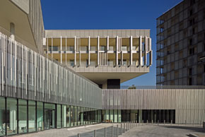 This project is located in an urban area of Rome in the throes of a significant mutation. With the valorisation of the Tiburtina Rail Station and the completion of its bridge-like building, the area known as Tiburtino II has passed from marginal to strategic. The occasion for this project was a restricted invited competition, awarded to Labics in 2007, for the valorisation of properties owned by ATAC Spa [Rome’s public transit company]. The site is a former trolleybus depot, with a total of 5,200 sq. m of floor area and 4,600 sq. m of open lots. The new project integrates an existing portion of the entrance structure. The northern edge of the lot is defined by an IACP public housing project from the 1930s by the architects Guido Guidi and Innocenzo Sabbatini. The southern edge faces abandoned warehouses, a high-speed artery with intricate intersections and ramps and the perimeter wall of the monumental Verano Cemetery.
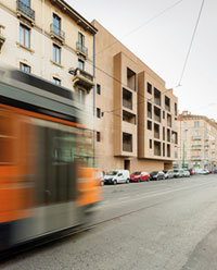 This project is located in a semi-central part of Milan, witness during the early twentieth century to a process of urban expansion based on a system of residential blocks interspersed with areas of industrial and artisanal activities. This mixture of apartments and small and medium-sized businesses is still present in the Garibaldi district and along Via Procaccini. Another characteristic of this area is the scarcity of landscaping and an absolute saturation of built or paved surfaces without trees. The project is a building in the midst of buildings, in a void created by a demolition. It most interesting aspect comes from being a modern building in the midst of others from the early twentieth century. The Milanese “ringhiera” – balcony – apartment block is the reference for the internal elevations, while the technical regulations of the local Urban Plan governed the volumes and elevations.The plans were not generated from the resolution of the corner and the two aligned volumes to the side, but are the result of an inverse process. The starting point was the side buildings, which come together harmoniously in proximity to the corner. The choice to use a unique “U”-shaped stair proved to be a substantial element in the definition of the continuity and geometrical cleanliness of the plans.
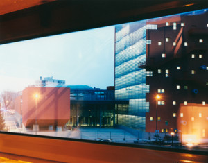 This project is part of the university centre of the IULM (Libera Università di Lingue e Comunicazione) in the southern periphery of Milan, an urban environment with a solid structure of roads that remains coarse and heterogeneous and devoid of any clear hierarchies between buildings and landscaping. The project by 5+1AA assumes the responsibility of becoming a point of reference not only for the IULM campus, but also for an entire part of the city. On the exterior the element that becomes a catalyst for the entire campus is a tower building able to function as a landmark and a point of reference not only for the users of the campus, but for this entire part of the city. The objective was precisely to offer the building to as vast a public as possible, and not only to students and professors.
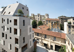 Building K19A is the renovation of a garage whose roof is comprised of a succession of barrel vaults. This extremely complex project was resolved in plan thanks to the introspection of overlooks from double height internal patios. Considering that the renovated building is for the most part intercluded between its neighbours, the main elevation, used to capture as much natural light as possible, is the surface of the vaulted roof. Worthy of mention is the selection of materials adopted in various situations. The vaulted roof is clad in titanium-zinc panels. The elevations are finished in friulana piasentina stone and white and red plaster. The exterior paving of the patios and brise soleil in front of them are in wood. Building K19B, connected to K19A by an underground garage, is a new 5 storey building with two attic levels. The layout is reminiscent of an apartment block with a stair serving 2 or 3 apartments per floor. The talent of the architects is evident above all in the ability to transform a geometrically complex situation into a source of morphological inspiration.
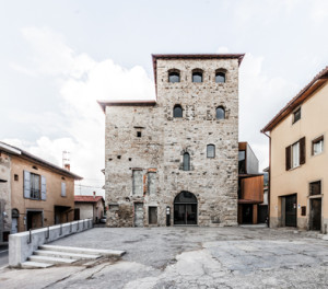 This project, inherently tied to the theme of building in the built, consists of a pair of medieval towers and the addition of a new volume at their base. The client’s objective was to recover the medieval structures and requalify the public square in front of them. To save a historic building from a ruinous state of abandonment it is indispensable to continue to use it. This was the principle that triggered the process of gradual recovery and reuse. The new use identified was a Civic Library. This function was distributed in three volumes: the two connected towers in exposed stone, only one of which was fully restored and consolidated, and the new volume, finished in copper and plaster and hosting service spaces and vertical circulation. The project also includes a portico with a “scale-like” roof in the public square.
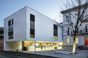 This new project in Via Volta is an exemplary case of a new construction in an intricate and consolidated urban context. The fulcrum of the project is a historic nineteenth century villa with a compact quadrangular plan. The perimeter of the lot is highly irregular. The programme called for a double basement for parking, a ground floor for commercial activities and apartments, and upper floors for apartments, in part on two levels and in part three levels plus an attic. Comparing the drawings with the programme reveals the notable complexity of this project. Despite its small dimensions, it is a concentrated interconnection at different scales, ranging from the relationship with a historic building to a multipurpose programme that must coexist inside the same complex of buildings.
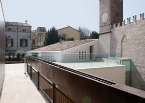 House “Z” is an example of a contemporary project inserted in a very historical context, to which it relates with taste and without provocation.The house is situated inside the third ring of the city of Mantua, inside the Renaissance addition that is home to some of the most important buildings left by the Gonzaga family, between Via Chiassi, which leads toward the city centre along a succession of noble palaces from different eras, and Via Principe Amedeo, a section of the Gonzaga’s private road connecting the grand buildings of the fifteenth and sixteenth centuries, the basilica of Sant’Andrea, the Church of San Sebastiano and the Palazzo Te.The project designed by Vittorio Longheu is thus inserted in an area of prestigious apartments, set between two late-Renaissance street fronts. The lot was occupied by a layering of various constructions that the new intervention attempts to harmonise using a contemporary language and proposing itself as the latest in its possible configurations.
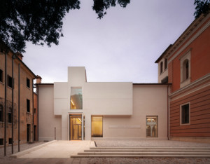 The project is inserted in a Jesuit convent from the fourteenth century. Situated in the historic centre of the city of Treviso, the site has been home to a museum since 1889.In 2010 City Government organised a competition to access European Funding for the renovation of the complex as a modern art museum dedicated to Luigi Bailo. In addition to restoring the structure, the designers also introduced a triple height gallery inside a small courtyard. This new volume is an architectural graft situated between the public square in front of the entrance and the museum itself. The architects proceeded by minimalist interventions, inserting a new architectural element to achieve diverse objectives. In addition to creating functional spaces, the gallery-atrium was designed for the main elevation of the museum, facing the church of Sant’Agnese, as an extrusion of the flat and anonymous south elevation reconstructed in the 1950s.
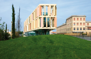 The project by Archea is part of a vaster programme for the interior and exterior renovation of the entire health care facility. There is no increase in the number of hospital beds, but rather a redistribution in larger and more comfortable spaces.The project is inserted in an urban fabric typical of numerous maritime locations along the Adriatic, legible in strips running parallel to the coast. The form of the lot, facing the state road and surrounded on four sides by vehicular routes, modelled the narrow and elongated proportions of the Pavilion. A transparent three-storey volume, protected for two thirds of its height by a suspended screen of panels in the colours of a seaside town, was completed after little more than two years of construction. A gentle path between lush grassy hills leads into the hall, an uncovered and protected space occupied by a tree, a symbol of growth and rebirth.
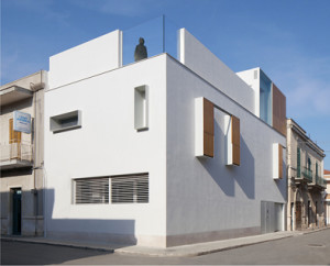 This project is situated 250 meters from the main public square in Bitritto, on a corner lot between Via Filzi and Via Ariosto. It is part of a compact urban fabric characterised by a succession of heterogeneous constructions from different periods with varying architectural quality.Prior to its transformation, the building demonstrated all of the characteristic elements of speculative constructions from the 1960s and 70s: balconies, metal railings, thermal bridges and masonry cladding, columns projecting above the roof and ready for an eventual addition. Rather than being limited to compromised operations to reorganise the interiors, the architects opted for a more radical approach, that transfigures the conditions of the building in its relationship with the street and the city. This operation stripped the exteriors down to the load bearing structure.Inside the exposed frame, House CS was reborn as a clear, candid and rigorous volume. With respect to the existing building, the residence was subjected to a process of “bunkerisation” focused on preserving the privacy of family life.
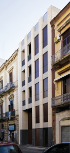 Picos_01 is a new building in the heart of Bari, where the patterns of the grid designed by Giuseppe Gimma in 1812 taper off toward the Libertà neighbourhood. The project substitutes an existing two-storey construction of no particular architectural value, recomposes the street front and fills the gap between two classically inspired buildings of the so-called nineteenth century “Borgo Murattiano”. The new building designed by Lorenzo Netti is larger than the structure it replaced; approximately five storeys connected by a single stair-elevator, with a total of 8 apartments of different dimensions, arranged two per floor. The theme of substitution is a typical of the neighbourhood, consisting primarily of residential buildings from the 1940s-60s, where insertions and demolitions within the urban fabric have produced diverse results over time and led toward contrasting urban planning measures. The elements of continuity between the nineteenth and twentieth centuries, evident above all in the façades, a diaphragm between public and private space, are what Netti refers to as “Moderno Murattiano”.
ARGOMENTI
– La rigenerazione dei quartieri di edilizia residenziale pubblica. Corviale come progetto pilota – Pag. 98
– 21st Century. Design After Design. Riaprono le storiche esposizioni della Triennale di Milano – Pag. 105
– Concorso internazionale per la pianificazione urbanistica di Jinshan, Marina di Shanghai – Pag. 106
– Il Tabiat Bridge a Teheran – Pag. 110
NOTIZIE – Pag. 112
LIBRI – Pag. 116
PANTOGRAFO – Pag. 117
Questo post è disponibile anche in: Italian


