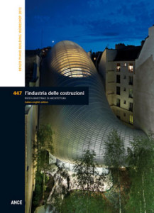
Just one year after being inaugurated by the Former President of the French Republic Valéry Giscard d’Estaing on 31 January 1977, issue n. 76 of L’Industria delle costruzioni from February 1978 published the Centre Georges Pompidou by Renzo Piano & Richard Rogers. The presentation of the building intentionally avoided any critical commentary, opting instead for short captions and explanations of the project and its construction, penned by Renzo Piano himself. In the wake of the criticism, comments and most disparate interpretations that accompanied the opening of the Beaubourg, the intention of the magazine, attentive toward the documentation of international experiments and innovations in the building industry, was to suspend any judgement and concentrate on aspects of its design and construction as a possible model for other projects, leaving the reader free to draw conclusions. At this time, the dominant architectural culture in Italy was moving in a completely different direction. Research travelled along what would later be termed the “Strada Novissima” (the New Road), presented at the 1980 Venice Biennale and whose influence can still be felt today. This marked the birth of what Pierluigi Nicolin referred to in 1994 as the “case of Renzo Piano”, an architect who some saw as the authentic expression of Italian Humanism, capable of a “unique synthesis between architecture, art and engineering”; others, including the academic world, considered him an atypical and aloof figure, who became the object of mistrust rather than of curiosity and a desire for comprehension. In this context, which could be termed one of exile, Renzo Piano, together with his Building Workshop, has become the most famous and respected architect in the world, with more that 100 large-scale and public buildings constructed around the globe. In this issue, dedicated to the five most recent projects by this architect from Genoa, L’Industria delle costruzioni, which has never ceased to follow the phases of Piano’s work and publish their results, resolutely confirms the value of Renzo Piano’s contribution to the culture of contemporary architecture. His projects, which are never characterised by a signature or clearly recognisable style, speak of a profound coherence and rigorous method. His approach to architecture resolves the problems of dwelling with the sensitivity and intelligence of a craftsman united with research and experiments with the most advanced technologies, without ever losing sight of the human scale and the environment as the unquestioned protagonists of architecture.
RENZO PIANO BUILDING WORKSHOP. THE GENOA AND PARIS WORKSHOP – Pg. 4
Lorenzo Ciccarelli
THE MAN WHO SPEAKS TO STONES – Pg. 12
Kevin Ramsey
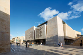 In 2009, after various events, Renzo Piano Building Workshop was awarded the project for the rehabilitation of a 40,000 m2 area situated between the pentagonal bastions of St. James and St. John, focused on the entry portal, the City Gate, and the city centre with its new Parliament, Opera House and gardens, reconfiguring the historic defensive moat. With its focus on the entry gate, the project reconfigures the area for pedestrian use and in relation to panoramic views. The infrastructural axis is based on a new architectural graft: the Parliament and its annexed offices. The intersection of oblique axes led Piano to develop a composite and faceted work of architecture, generated by oblique perspective lines and inclined planes that reference the existing stone walls, with the sinuous external bastions and two outposts situated inside them. The use of the same golden Gozo stone for all interior and exterior paving creates a unified and genteel urban chorography that appears to have always existed.
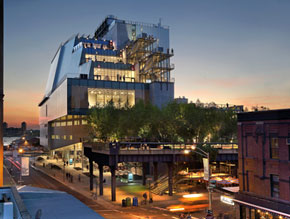 The history of the Whitney Museum of American Art is rife with criss-crossings of the Manhattan Island in the search for larger exhibition spaces. This search culminated in 2015 with the opening of its new home designed by Renzo Piano Building Workshop in the former Meatpacking District. In the new Whitney Piano reworks the idea of urban continuity between a building and its context that also guided the project for the expansion of the historic home of the Museum in the Upper East Side. Piano’s architecture is systematically structured by collective spaces that, from the surrounding urban context, move into and structure the interiors he designs. The resulting plaza was baptised the “largo” and would become a dogmatic element of the project that substantiates one of the fundamental nodes of the final architectural proposal. The Whitney asked Piano to design an exhibition space that was double that of Breuer’s building, accompanied by an auditorium, workshops, educational spaces and administrative offices, for a total of 19,500 m2, almost six times the size of the lot. Hence it is easy to understand why the project could only grow vertically.
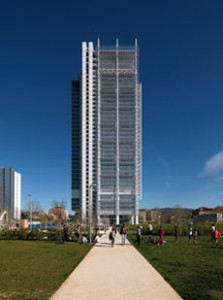 This skyscraper in Turin by RPBW was inaugurated in April 2015. It is the result of an international competition organised in 2006 by the Turin-based banking group Intesa Sanpaolo for the design of a new headquarters and office building for 2,000 employees. Its representative value as the home of the head of the Group required an innovative approach to environmental sustainability, the quality of working environments and a seamless bond between public and private space. The Turin skyscraper was designed to capture fragments of the city, ensuring optimum conditions of lighting, air and vegetation. The tower stands on a lot near the Porta Susa rail station, a nerve centre of urban and metropolitan transport lines, currently in the throes of an important facelift. The new building is immersed in a specially designed landscaping project. With its rectangular, 700 square meter floor plate, this steel and glass parallelepiped rises as a compact form against the sky over Turin. At 166 meters in height, it is only slightly lower than the Mole Antonelliana, the monumental icon and symbol of the city that dictates the maximum height of Turin’s urban skyline. Each office floor is an assembly of open spaces, private areas, meeting rooms and food areas, designed to host 100 workstations. Two regular volumes project from the flanks of the tower: the one to the north hosts the meeting and conference rooms, while its symmetrical twin to the south contains the steel fire stairs, wrapped by glass walls.
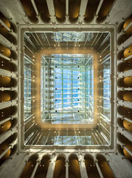 The renovation and expansion of the Harvard Art Museums, inaugurated in November 2014, belongs to the vast portfolio of museums designed by RPBW. In this case the office applied its current hyper-technological style to an American academy among the most important in the world. One of the building’s close neighbours is Le Corbusier’s Carpenter Center for the Visual Arts (1963), whose rigid modernist forms clearly contrast with the false renaissance approach adopted in design of the original museum from the 1920s. The project by RPBW at Harvard links together three existing museums – the Fogg, the Busch Reisinger and the Sackler (a total of 9,718 m2), increasing the floor area by approximately 40% and providing the complex with new exhibition spaces, better equipped restoration laboratories and a new 294-seat auditorium. The complex was increased by two floors above grade, and three below. Its appearance has been changed by the design of an impressive new glazed roof spanning the interior courtyard (35,29 m in height) and evoking images of the large exhibition halls of the era of the Grand Palais. Every detail reflects the use of the most advanced technologies and an almost craft-based approach to architecture, the modus operandi of RPBW.
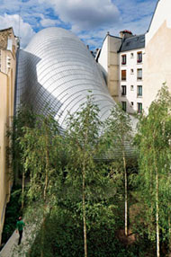 The Seydoux-Pathé Foundation was created in 2006 to conserve and promote the heritage of the Pathé film production company, founded in 1896. For its new home the client had established very simple objectives: conserving its rich and more than one hundred year old legacy and at the same time promoting it to the public.The new home of the Pathé Foundation is situated in the courtyard of a city block along Avenue des Gobelins, in the 13th arrondissement, a few meters from Place d’Italie. The first sketches by the Genoese architect present a form inspired by the rounded profile and yellow colour of the Pathé logo: the metaphor of a magic lantern illuminating the rooftops of Paris. The building hangs, where possible, from the sidewalls of the courtyard, separated from the perimeter, in order to bring natural light into this space. The division of the space follows a clear alternation. On the one hand the necessary darkness of rooms for archives, projections and the exhibition of delicate objects from the world of cinema; on the other hand the openness and luminosity of exhibition areas, the research centre and offices. The fully glazed ground floor allows uninterrupted views from the street along the entire length of the building, as far as the small garden at the back of the courtyard.
Questo post è disponibile anche in: Italian


