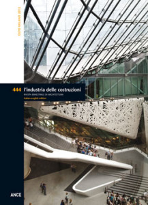
 More than one century after the first Italian Exposition of 1906, EXPO 2015 is back in Milan. A success, despite the polemics, delays and judicial investigations, in a city in a constant state of ferment thanks to the numerous transformations present across its territory. Among the projects tied to EXPO, Milan recently inaugurated the requalification of the Darsena, between Porta Genova and Porta Ticinese, designed to re-launch the Navigli district. To the north, clearly visible from the EXPO site, are the new bridges and motorways designed by Citterio Viel & Partners for an infrastructure that will connect the A8 Laghi motorway with the Western Ring Road. EXPO is also easy to reach from the seven new towers in Cascina Merlata (520,000 sqm), currently serving as the EXPO Village for international delegates. The area of Tortona was recently witness to the inauguration of the City of Culture designed by David Chipperfield on the former Ansaldo lands, while Rem Koolhaas’ project for the Fondazione Prada recently opened in a former distillery. The EXPO site is situated in the area of Rho Pero, to the north-west of the city centre. The site is well served by rail lines and the city’s subway. A simple and orderly urban plan, structured by the 1,500-meter long Decumanus and the crossing 350-meter long Cardus, orients visitors and integrates the variety of pavilions and other attractions. The original concept is the work of an international team of consultants, composed of Stefano Boeri, Richard Burdett, Joan Busquets, William McDonough and Jacques Herzog, developed by a group of recent graduates from the Politecnico di Milano, working in the EXPO 2015 Planning Office. EXPO management asked participants, among other things, to alternate open and closed spaces, earmarking at least 30% for landscaping and preferring prefabrication and dry construction technologies to facilitate the assembly and subsequent disassembly of the pavilions. The answers translated into a multiplicity of approaches to the theme of assembly and the use of wood and steel construction technologies, linked to the expressive intentions of each participating nation. Together with the other pavilions presented in this issue, selected for their twofold ability to integrate evident aspects of architectural interest with innovative choices of technologies and building systems, we look at the Italian Pavilion by Nemesi. The only structure to remain after the Exposition, it constitutes the fundamental hub of any visit, with its experimental façade in catalytic white concrete, mixed with Bianco di Carrara marble dust.
MILAN EXPO 2015 – Pag. 4
Paola Pierotti
WALKING THROUGH THE PAVILIONS – Pg. 24
Valerio Paolo Mosco
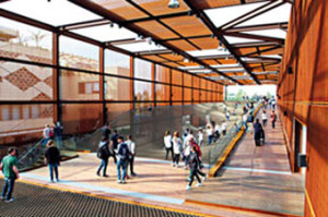 The Brazil Pavilion was designed by the well-known Brazilian architect Arthur Casas, in collaboration with the celebrated designer Marko Brajovic. The pair were awarded the competition organised by APEX Brazil, an agency that promotes exportations and investments. The winning design mixes architecture and scenography, using the themes of breeding and agriculture to suggest typical Brazilian values that respond to the theme of EXPO 2015: Feeding the Planet. Visitors are immersed in a temporary pavilion defined by an immense steel portal finished in cork that defines an open public plaza, capable of stimulating the senses, involving and interacting with visitors. A large flexible net set to one side of this space evokes the multiple realities of Brazil. For the designers this mesh represents a horizontal surface, and its elements are used to produce synergies with individual or collective solutions, beginning with the preservation and safeguarding of natural resources, such as those of the Amazon Forest.
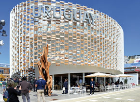 This is the first time this small South American nation participates in a Universal Exposition. The elliptical structure in steel and wood, wrapping an spiralling interior space, represents the country’s manifesto Life Grows in Uruguay. Designed by a team of architects and engineers under the guidance of the architect Javier Diaz from the INAC (National Meat Institute), the Uruguay Pavilion is the fruit of a unique compositional gesture: a sinuous line that wraps back around itself to define 785 square meters of exhibition space, rest areas and spaces for dining inside a three-storey cylindrical volume. The perimeter is defined by thin vertical steel fins. Rough blocks of wood are randomly inserted between the fins, in opposition to their regular rhythm, to create a multi-material skin that helps to screen the interior of the Pavilion against the sun’s rays. Steel, the modern material par excellence, is juxtaposed against these rustic, rural wooden blocks, as if to emphasise to what degree innovation and tradition represent the fundamental ingredients of sustainable development.
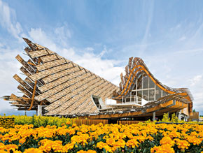 The Land of Hope is the theme of the Pavilion of the People’s Republic of China at EXPO 2015. The design by Studio Link-Arc translates this theme into a concept that stands out for its particular undulating roof that fuses the profile of the city – to the north – with that of the landscape – to the south. Hope is possible when nature and city coexist in harmony. The Chinese Pavilion is one of the most complex constructions in Milan. Fundamental to the success of the project was the synergy between numerous international and local professionals. The suspended roof was realised in a laminated wood structure that refers to the traditional Chinese system of the “raised-beam”, adapted to modern building technologies. In a particular nod to Chinese culture and history, the exterior of the roof was finished in bamboo panels, shipped by sea directly from China to shade the interiors of the Pavilion. At grade, “the field of hope” is defined by a landscape that evokes fields of wheat: outside is a sea of yellow flowers, while inside the wheat field becomes a multimedia installation.
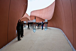 The pavilion of the United Arab Emirates was conceived as a bridge toward the future: a presentation in Italy of how the Arabian Peninsula approaches and works to resolve the problem of scarce resources and a manifesto of what the 2020 Universal Exposition in Dubai holds in store. The concept evokes the pedestrian streets of Arabic settlements and the soft forms of the desert: the pavilion resembles a 140-meter long and 40-meter wide canyon, some 12 meters in height. This path accompanies the visitor toward a cinema that represents the true fulcrum of the pavilion. Here visitors are treated to projections of a film which recounts the lengthy history of the countries of the Arab world as a trip through time, speaking about resources and a sustainable future. The pavilion stands out for the elevated use of dry assembly technologies, as requested in the Brief published by EXPO Spa. Perhaps what is most impressive is the plan to disassemble the pavilion and rebuild it in Masdar City after the event in Milan.
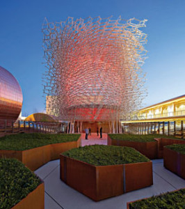 Designed by the English artist Wolfgang Buttress and BDP, the UK Pavilion is inspired by the fundamental role of pollination in the food chain. In reality, the selected theme – Grown in Britain – clearly reveals the metaphoric sense behind the Pavilion. The reference to Great Britain and the image the designers wish to present is largely didascalic, though undoubtedly effective. However, the reference to pollination is also an occasion for celebrating the English landscape. In fact, the United Kingdom is the birthplace of Landscape Architecture, which permeates all Anglo-Saxon culture. The Hive is the focal point of the perspective and pulsating heart of the entire composition, this large perforated aluminium sphere is the perfect synthesis of maximum artificiality and maximum naturalness, suspended between nature and architecture. The process of producing and assembling the sphere is of undoubted interest. This immense sculpture was conceived and designed to be easily disassembled and reassembled elsewhere, after EXPO. The 169,300 pieces of The Hive were prefabricated and, once on site, assembled in less than three months, by a team of only 12 people.
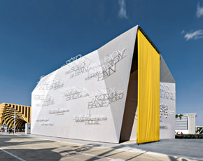 The symbolic and cultural theme is certainly the guiding element of the design of the Holy See Pavilion. This was conceived to resemble a solid and compact mass, whose surfaces support the communication of the Christian message. Scripture becomes a poetic and architectural image rendered in wireframe words projecting from the walls, suspended in a void; the words are multiplied and expanded across the façades by the changing inclination of the sun’s rays. Completing this symbolic message, the mass is topped by a garden, the “space” of faith par excellence. The Pavilion is a unique monolithic and mono-material volume, cut by sloping planes that reflect variations to the interior exhibition spaces on the exterior. The most interesting element of the Pavilion is its important investigation of the profound symbols and values of Christianity through a refined architectural design. Surfaces and finishes pursue sobriety and efficiency, expressed through the use of simple and sombre materials and lightweight dry construction systems.
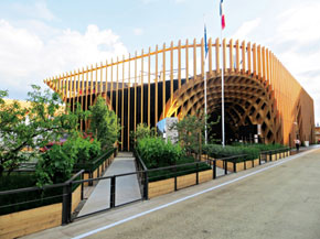 The form of the Pavilion attracts visitors and draws them inside: a 180° inversion of a slice of the earth’s surface. An accurate and articulated territorial cross section of hills and valleys is expressed as a continuous alternation of concavities and convexities. In synthesis, the Pavilion resembles a large cavern whose underside is used to suspend a variety of different objects. The designers wished to simulate a large market, a space of trade. Outside, a succession of framed gardens offer the public an image of France’s agricultural landscape. The 3,592 square meter pavilion is constructed primarily of laminated French lumber: fir inside and larch outside. The diverse elements of the primary and secondary structure, the ceiling, paving and openings are interlocked to create a unique element that simultaneously defines the external envelope and internal volume.
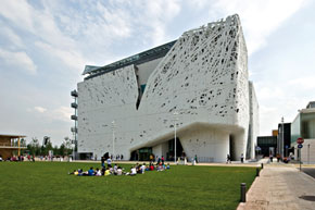 Palazzo Italia is the only installation that will survive the temporariness of the events and, therefore, has been conceived with a completely different approach compared to all the other pavilions of this Milan Expo. Located just close to the “Tree of Life”, it represents a fundamental pivotal point of the visiting trek. The most identifying element on an aesthetic level is certainly the white outer covering of the façades, where it is represented the ramification of a group of trees thinning out the more they try to reach towards the sky, until a cone of light from a magnificent structural glass on the roof comes out from the branches and infiltrates through the “concrete trees”. Palazzo Italia presents itself as a space to be lived rather than to be seen: the proof is the wide internal piazza that welcomes the visitor at the level zero and is completely free for everyone, independently from the access to the upper levels.
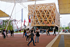 The Chilean Pavilion is the work of the multi-award-winning Chilean architect Cristian Undurraga who, for many years now, successfully manages to unite a clearly modernist language with a highly refined use of natural materials. The Pavilion both confirms and, if possible, exalts this vision in a 360° work of architecture, despite the limits and temporary life of an exhibition pavilion. An attention-grabbing structure in laminated pine defines a regular parallelepiped suspended above the ground on six, three-fingered dark steel columns. In addition to conferring a certain monumentality, thanks to the almost totalising use of wood, it also introduces an indisputable “familiarity”, favouring an exchange of views and functions between interior and exterior, between public space the private spaces of the Pavilion, all without imposing its presence, though clearly declaring it.
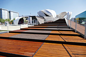 The pavilion is a convincing translation into a contemporary architectural language of the landscape of fields and pastures, immense forests and undulating hillsides and valleys so common to late nineteenth century German literature. The building was conceived as a gently sloping plateau, whose interior spaces host a thematic exhibition. The path is flanked by stylised plants, referred to by their authors as seeds of ideas that wrap the exterior of the Pavilion and spread into a broad roof of leaves shading a raised public terrace. This unifying element links interior and exterior space, architecture and exhibition. The suspended leaves are in reality covered with small printed organic photovoltaic cells that provide the pavilion with energy. Printed almost invisibly on a surface of hexagonal elements of differing colours, the cells were integrated into the membrane used to create the large stylised leaves.
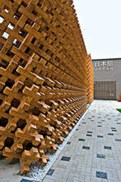 Through its participation at EXPO Milano 2015, Japan presents its food culture as an example of healthy, sustainable and balanced nutrition and a model of integration between man and nature. Harmony, Diversity, Tradition and Innovation are the key concepts, in the words of the organisers, underlying the construction of the future of Japanese society. Traditional Japanese techniques of wood construction, placed in “compressive tension”, a condition in which each single element is connected by joints and overlaps to obtain the required bearing capacities, characterise the main structure of the Pavilion. Unifying traditional building techniques with modern structural analyses, the pavilion is an innovative example of architecture capable of fully expressing the fusion between traditional culture and advance technology.
ARGOMENTI
– Il Padiglione Italia di Maurizio Sacripanti al MAXXI – Pag. 106
– Urban Algae Folly. La copertura che coltiva microalghe – Pag. 108
– Il nuovo cantiere della Città della Scienza nell’area delle ex caserme di via Guido reni a Roma – Pag. 112
– Rigenerare le periferie urbane. Proposte e ricerche a confronto – Pag. 118
NOTIZIE – Pag. 120
LIBRI – Pag. 124
CALENDARIO – Pag. 126
Questo post è disponibile anche in: Italian


