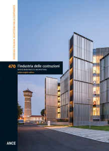
There is no doubt that the issues of this magazine, dedicated to a review of Italian architecture, document only a fraction of a much larger number of activities modifying our environment. That said, the 13 projects selected for this issue represent a multiplicity of themes, lines of research and languages that remain vital to Italy. This despite the fact that politics no longer recognises architecture as a source of quality and beauty or affords it the value of a tool of cultural and social growth as in the past. In a condition of marginality, pushed aside by other figures, only apparently competitive and part of ever more complex projects, bogged down by the fragmentation of specialisations and the magma of bureaucracy, some architects tenaciously resist; they continue to believe in the social utility of their craft, which they consider more than profession. The design themes against which they measure their work are generally linked to work for private clients and small – to medium-sized projects; large public projects, if and when they are realised, are the privilege of a rare few, with endless times for completion and excluding the involvement of younger generations, a priori. The private single – and two-family home, an important testbed and occasion for experimentation and growth for any architect, remains one of these themes, as demonstrated by three examples presented in this issue.
Another theme common to the majority of the projects selected for this issue is the transformation of the existing through interventions of reconfiguration, reuse and expansion; this theme dominates current architectural production and constitutes one of the principal challenges for architects. A challenge that implies new interpretations and processes of rewriting. Brownfields to be reabsorbed, schools to be made safer, more energy efficient, adapted to new educational requirements or placed at the service of a vaster urban community, buildings of value or, on the contrary, of no value that it would be more convenient to modify rather than demolish, become the object of interesting formal manipulations.
BRUNO ZEVI’S IDEAS IN ITALIAN CONTEMPORARY ARCHITECTURE – Pg. 8
Antonino Saggio
ECLECTICISM THROUGH CONTINUITY. THE UNEXPECTED VITALITY OF ITALIAN CONTEMPORARY ARCHITECTURE – Pg. 12
Valerio Paolo Mosco
IAN+ BETWEEN UTOPIAN IDEAS AND REAL BUILDINGS – Pg. 20
Luca Galofaro
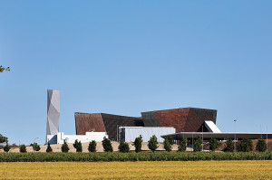 The design of this new bioenergy power plant involved the refurbishment of the 47-hectare ex Eridiana industrial site at the edge of Ravenna. Twenty-eight hectares were reclaimed and re-naturalised and nearly three hectares of wetlands restored. The bioenergy plant occupies the residual area. The biomass structure is fed with wood chips from the trees grown on site, grass clippings, material from the cleaning of the riverbanks and pruning. The estimated annual production will provide energy for 84,000 families and save 117,000 tonnes of CO2 emissions into the atmosphere. The project is the crasis between the worlds of agriculture and industry; its edges were imagined as berms of varying heights serving as an interface between two environments. It was approached as a territorial/landscape intervention; its signs and materials, at the territorial scale, are derived from the agricultural world, while the main building is clad in natural wood.
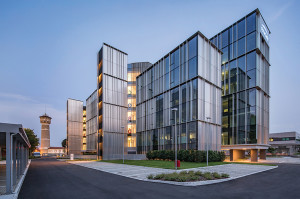 The renovation project completely rethinks a building of low architectural quality from the early 1980s and provides the area with a contemporary building, congruous with the strategic development of the Bicocca district. Rethinking a building from the ground up favoured the re-proposal and re-modelling of its massive volumes to obtain a lighter and more articulated configuration. The project reimagines the flexibility of the internal spaces and offices. The façades were modernised to reflect current requirements for energy savings and acoustic performance. The modular façade is composed of glazed units overlapped by a composition of horizontal and vertical anodised aluminium frames that fragment the building’s dimensions. One relevant aspect of this operation is represented by the improvement of energy performance.
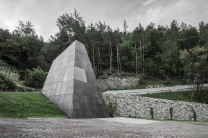 The Pacherhof building is classified as example of architectural heritage to be safeguarded and conserved for its historical value. The need to renovate, expand and modernise the building produced a project structured by two principal actions: the restoration of the pre-existing building and an addition that doubles its volume and organisational logic based on a primarily hypogeal structure and a building emerging from the ground. The highest corner of the site is marked by an emerging pyramidal tower clad in bronze panels. This symbolic and representative element contains an office and tasting room on the upper level. The choice of material reinforces the contrast between the new and old buildings: rough plaster and metal panels for the addition and smooth plaster and wood for the historic winery. Elements such as oak casks and steel tanks, the ancient vaults and the new forms of the addition, the faded plaster of the existing winery and the rough plaster of the new building establish relations that emphasise the historic, cultural and sensory values of the project.
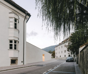 This addition to an existing music school made possible to preserve both the uniqueness of the historic part of Bruneck in which the project is sited and the important role played here by Villa Ragen. The architects opted for a minimalist intervention, respectful of pre-existing elements and focused on defining a new edge around a garden. The new construction continues the existing urban fabric, completing by analogy the pattern of association between noble villas and walled gardens. The project also heightens the urban importance of Villa Ragen by approaching the addition as complementary to this existing building.The garden is the heart of the functional organisation of the school and a space of relation between the old and new buildings. This large and protected space favours an atmosphere ideal for studying during school hours and for outdoor events and concerts open to the community.
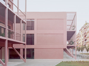 This project is an expansion and redesign of an existing school built during the 1960s. The design pursued two principal objectives: establishing a dialogue with the existing building and, at the same time, revolutionising its functions by introducing new spatial elements, transparency and additions that reinterpret the original structure and open the school up toward the city. The project develops through additions: a new steel structure creates an inhabitable envelope whose terraces are an integral part of the school’s learning spaces. In addition, it provides new connective spaces and functions as a passive screen. The modularity of the new frames designs a filiform skeleton finished in metal mesh to emphasise visual permeability and the relationship with outdoor space. Nature enters into the building and common areas used on a day to day basis by students. The innovation of the school and the insertion of new architectural and spatial elements make the Fermi School a replicable model for the requalification of existing school buildings.
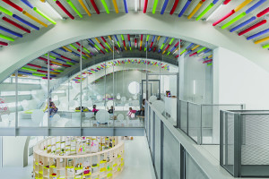 This project involves the transformation of a former garage into a new kindergarten and sports centre. It is founded on the union between architecture and pedagogy, and the conviction that space is an essential component of any child’s education. The design fully reflects the structure’s educational and organisational objectives, centred on the core values of sharing and participation. The double height Agora is the symbolic heart of the project. It is simultaneously an atrium and entrance, a space of meeting, socialisation and gathering. The materials used for the envelope respect the desire to conserve and expose the industrial identity of the original construction. On the contrary, the furnishings favour the use of less abstract and more colourful, textured and almost tactile materials. The basement features three pools, whose realisation required important structural works to the foundations of the existing building. These facilities are housed in an independent space, directly accessible from the city.
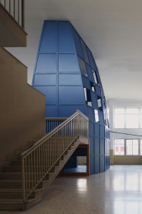 The project represents a symbolic intervention marking the inauguration of a renewal programme for more than fifty schools across Italy. It features a very low budget and the need to ensure robustness and durability. In addition, the new element added to the pre-existing school had to respect an educational programme that proposes changes of the very concept of the classroom and spaces of the school. The existing building was a typically average work of post-war architecture. The entry atrium was low, with two fenestrated wings leading to the classrooms, preceded by double height internal piazzas that were rather empty and alienating. The action focused on designing a large new sign/façade composed of an alternation of solid and void blue rhomboids. A strong sign was overlapped on the old building, constructing a fascinating play of shadow and light that clearly highlights the entrance, operating at the scale of the neighbourhood. Once inside, a hexagonal totem supports two continuous blue lines that lead toward a rhythmic sequence of inhabitable spaces. Desks, pouf and walls welcome any form of experimentation in a sequence that transforms the corridor into a street with the widenings and small piazzas typical of the blue landscapes of the Mediterranean.
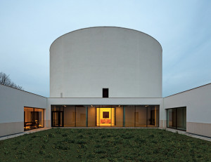 A large bronze sculpture of the Cross marks the entrance to the church, sealing its sacred nature and presenting an unequivocal symbol of the “call” that gathers the community. The architectural layout of the parish church begins with the composition of two geometries: the circle, the pure form par excellence of the church, and the rectangular-plan volume of the podium. This latter is characterised by a central cloister typical of a convent and fronted by the various spaces of the parish centre. The double height volume of the church stands at the centre of the entire composition, defining the long church square paved in stone. The construction of this building reflects the peculiarity of its forms and a defined system of correspondences and actions that “link” volumes and functions in a system whose unity heightens the recognisability of the spaces of the liturgy, of passage and of the community. In other words, the true material of this project.
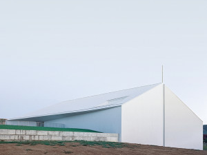 The design of this new church, recently inaugurated in San Lazzaro di Savena, in the province of Bologna, is the result of an important participatory process shared with the entire community, began in 2010. Starting with the archetypal image of the church, the project searches for an architecture stripped of the superficial, with essential lines and an immediate comprehensibility; sober, solemn but not monumental, an image of mystic daily life. The masonry envelope is in light colour, like the marble of important buildings, yet stripped of any overpowering material element that abstracts the simple geometries of the church, which stands out as a precious exception in its setting. The perimeter of the new church is defined by walls that slide with respect to one another to resemble large semi-open doors, identifying two entrances to the main hall, in addition to the principal portal. A continuous cut, from sky to ground and running the length of the roof, sections and splits the envelope of the church to expose the sky.
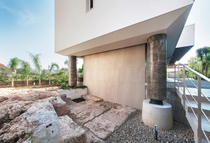 The architects imagined the building as “suspended” above the archaeological level, to guarantee the visual continuity of the system of quarries. The interaction between the building and the quarry below is managed by specific bearing points – set on 12 plinths. Exposed foundations establish a break between new and old and a particular condition made possible by the suspension of the building above the archaeological level below. The building appears to float above the large exposed plinths that support it and its imposing mass evokes the plan of some imaginary ancient hypostyle building. Above the foundations the architects designed a “truss” system: the building is suspended over the quarry like a bridge, a viaduct, an urban infrastructure. The south-east elevation – toward the cliff, the island of Ortigia and the city’s Porto Grande – relates to the large scale. Two large eyes framing the building’s four levels contain deep balconies, loggias and large windows. The north-west elevation, instead, relates to the city and assumes a more “urban” composition.
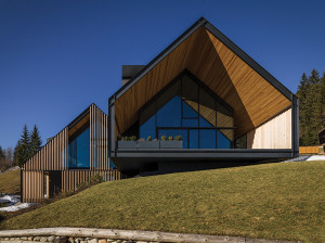 Z House is a holiday home. A place to live an intense relationship with nature and the mountains. The site on which the house is placed is a complex place, with a steep slope, access uphill and full of panoramic “frameworks”. The approach path is thus one of the key points of the project: the house shows itself from afar, then hides and then reappears in a scenic perspective from the bottom. The list of functions requested by the owners is rich and complex; the large living area is located at the entrance level and combines the two volumes into a single fluid space. The section achieves two objectives: from the outside the house seems to “slip” on the ground, is light and does not impose violent works on the landscape. From the inside the volume of the living area is designed by an impressive exposed concrete roof, which follows the slanting of the two volumes with different heights. The exposed concrete floors and ceilings, suspended on glass façades, accentuate the lightness of the roof. From the outside the house is characterized by an external “skin” made of wood, like many traditional alpine architecture.
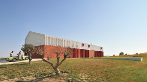 Rooted in the traditions of the rural homes typical of Marche region, this project borrows the compact and longitudinal development of en filade environments. The ground floor (living area), is clad in metal panels painted with a rust primer. The first floor (bedrooms) is comprised of a more enclosed and intimate portion and a hybrid space that mixes interior and exterior. The volume of the building can be crossed at different points and the relationship with the exterior draws the landscape inside the house. The design makes possible to identify the different blocks and parts of the house. The overall effect is reduced to the minimum by an elementary language that privileges the original concept over formal choices. The rhythm of openings and the cladding of the ground floor block are modular and sinusoidal; the same approach is applied to the volume-diaphragm on the first floor, in the wood partition. Situated at the edge of an urban setting, this sustainable building was designed according to the best passive bioclimatic practices and constructed using unusual materials for a residential project.
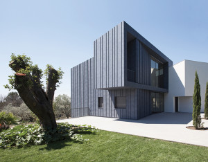 The house is autonomous, fenced-off and protected and expresses the theme of the isolated country house. The villa confronts also with the theme of separation by breaking the functions down into different parts: the residential nucleus, the entry, the pool, the outdoor kitchen, the woodpile. An architectural complex comprised of a series of environments set at different levels. The main pavilion, the house itself, is in turn split into three different areas: the living area, two levels of bedrooms, a filter linking these two volumes and containing the entrance and horizontal and vertical circulation. The three different parts of the house are positioned atop a large podium, partially underground. Villa Rosa employs a series of devices to capture the landscape. The volume of the terrace to the south, in particular, is a sort of telescope. While formally autonomous, it is structurally connected to the living area. A double skin guarantees bioclimatic performance in addition to resolving the passage from the nucleus of the house into the surrounding landscape. The envelope becomes a filter and space that can be occupied, similar to the public frame of some private object.
ARGOMENTI
– La via italiana al grattacielo negli anni Cinquanta e Sessanta. Tra invenzioni strutturali e dinamiche di cantiere – Pag. 108
– Contrastare il consumo di suolo: l’esperienza del progetto SOS4life – Pag. 115
– Architettura degli anni ’30 a Cosenza: il Palazzo delle Corporazioni – Pag. 118
LIBRI – Pag. 123
NOTIZIE – Pag. 124
Questo post è disponibile anche in: Italian


