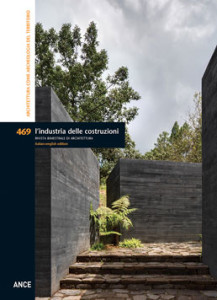
One of the problems faced by contemporary architectural culture, or post-modern to use Lyotard’s term, consists of the loss of preestablished principles or rules that serve as a reference for the construction of a project. The architect is required to rewrite a personal set of rules, case-by-case, considering architecture a hermeneutic activity founded on the concepts of belonging and dialogue. The design of architecture can thus be intended as a “story” added to the many others already present in the environment constructed by man, beginning with a pre-existing “text”, in other words, a physical context comprised of geographic, natural and anthropic components. Context, or “place”, represents the field of a co-presence and relativisation of space and time that marks the beginning of the design phase; this complex system of traces of pre-existing cultures of settlement, of the tangible signs of modifications made over time, constitutes the raw material used by the architect, through an act of interpretation, to reveal once unknown horizons of meaning. In metaphorical terms, this action is analogous to that of the archaeologist who, by digging into the earth, surveying what is on the surface, studying material and immaterial evidence, sheds light on forgotten histories. This is what inspired the title of this issue of the magazine: Architecture as territorial archaeology. It presents a selection of works by architects from the Portuguese, Spanish and Mexican schools, whose research is rooted precisely in the ideative phase, intended as the exploration of strong ties between architecture and the urban and environmental landscape. There is more. The works of architecture produced by these schools are conceived as “archaeological fields” in their own right, open systems, susceptible to new interpretations, as well as the complex existing territorial palimpsest. They become “places of experience”, far from any easy or flaunted iconography that seeks an immediate impact, that seek discovery and interpretation from those who use them. Mono-materiality, solidity, composition by parts, relations between interior-exterior, value assigned to the theme of natural light and connections with the surrounding natural or artificial environment are just some of the characteristics shared by these projects. Each has a strong poetic and evocative strength, obtained using only a few essential formal elements.
INHABITING THE TERRITORY – Pg. 6
Giovanni Maciocco
TERRITORY AS ARCHAEOLOGY – Pag. 12
Antonello Marotta
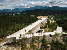 Situated in a forest in South Korea, Saya Park was designed by Alvaro Siza in collaboration with Carlos Castanheira. The project is a complex of three monolithic buildings in reinforced concrete that define a new landscape. The Art Pavilion is accessed via one of the paths that gradually cuts into the hillside. The entry sequence continues along the first volume of this building, containing a library, isolated from the rest of the gallery. The building features a bifurcation linked by a tunnel, which defines an inner courtyard, fulcrum of circulation space. The articulated circulation through the museum concludes with a skylight that recaptures a visual connection with nature, revealing the underlying sense of the project. The second building, the Nesim Nakwon Chapel, is marked by the combination of the basic elements recurring in the archetype of the hut, according to a principle of composition and subtraction. The third building sits atop a tall promontory. It consists of a Viewing Tower currently scheduled to begin construction in 2020.
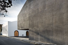 The Arquipélago Contemporary Arts Centre is located inside an historic alcohol and tobacco warehouse. It is a multidisciplinary centre dedicated to the promotion of the visual arts, theatre and dance. The new constructions are basic volumes that give form to external space by standing apart from the original building. The result is a non-invasive affiliation between new and old, without renouncing a specific identity. The new volumes are made from concrete with inerts made from the local stone and an addition of black and ferrous oxide pigments that reproduces the colours of the basalt of the existing buildings. A particularly interesting part of the project is the theatre building. The elimination of the classical separation between the stage and the audience ensures a great deal of flexibility. Fluidity and permeability between public space and internal space characterise not only the theatre building, but the entire complex.
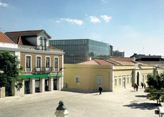 The NAC Contemporary Art Nucleus is located inside a refurbished resin factory. At the time of the design competition, the factory was occupied by the town market and various municipal services. The architects choice was to recover the original qualities of the factory by removing the roof over the central courtyard, built to host the market. The external form remained unaltered, while the internal distribution was modified to host the new functions. The existing building is now occupied by shops, restaurants, auditorium and museum of prints used to fabricate glass. A new cubic volume inside the courtyard hosts permanent and temporary exhibitions: the NAC emerges from the old factory, enclosed by a double glass skin. Other than helping control comfort inside the building, the double facade changes depending on the distance from which it is viewed and the incidence of natural light. Two walkways link the new building to the existing structure, making it an integral part of a single circulation route.
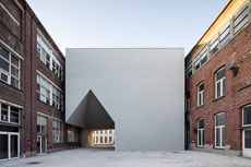 This project links together some of the characteristics of the urban morphology of the town. The town’s fabric, comprised of narrow streets, small squares and passage, has been interpreted at the scale of the urban block to build a succession of spaces between the different buildings occupied by the Faculty of Architecture. The design began with the demolition of existing structures, maintaining the hospital building and two industrial sheds. Aires Mateus architects inserted a new linear block that crosses the entire lot and contains a three-hundred seat auditorium. Thanks to an intelligent play of setbacks, the new building is clearly differentiated from the existing. This gap is accentuated by the finishes of the volumes: exposed brick for the historic buildings and white plaster for new constructions. The new structure resembles a large longitudinal plaza that creates a fluid space able to host different activities.
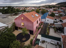 This project for the refurbishment of an historic industrial building is situated in the periphery of a small suburb, south of Lisbon. The area enjoys a Mediterranean climate and a series of hills to the west of the settlement. The building is a large and very tall rectangular space that exalts the archetype of the double pitched home at a gigantic scale. The architects worked with the existing building without adding volumes or other constructions. The original clay roof tiles were conserved and reused on the new roof. The wood carpentry from the original roof was reused to pave different parts of the garden while stone cladding from the walls was readapted to fabricate door and window sills. These actions were combined with an absolutely contemporary approach to the design of the interior spaces.
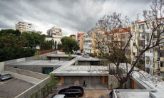
The project is located in a residential area, on a site occupied by a now demolished factory. The architect organised the project around a series of patios, reinterpreted as spaces that mediate between the two homes. The need to arrange the apartments around these void spaces was dictated by the desire to reinterpret the site itself. The composition is the result of the subtraction of portions of a one-storey monolithic volume. The project reorganises the experience of a landscape by structuring internal spaces of the project and the articulation of the building establishes a multiple awareness of relationships and connections between open and closed spaces. The irregular form of the lot is confirmed by the abstract, articulated and complex design in which each of the two homes is a system of space looking into courtyards offering a private and changing landscape. Both homes are made of a single material: reinforced concrete. The use of rough wood formwork produced a pattern on the surfaces of this single material, which varies and vibrates under natural light.
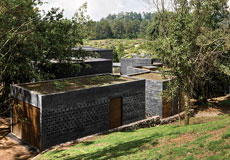 The design of Casa Bruma is best interpreted as a process of composition that is more topological than typological. This topographic architecture is born of the need to identify a relationship that interprets the site and establishes relations with the surroundings. The solution is rooted in the importance of respecting the environment, while the fragmentation is a result of the obligation to maintain the existing trees. The relationship with the landscape is emphasised by the presence of an external stair leading up to a roof terrace offering views over the mountains. The project highlights the independence of each volume, together with the interaction between them and the landscape. The element of the courtyard is intended more as a public space than an occasion for introversion typical of classical patio homes. The different functions are hosted in nine volumes that further reflect the morphology of the terrain.
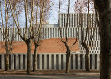
The Royal Collections Museum in Madrid is an extension of the podium of Royal Palace. The architects designed a project that respects the open space of Piazza de la Almudena. The Museum brings the archaeological materials and historic layers of the site to life, revisiting, reorienting and opening them up toward the city. The elevation becomes a true narrative motif made of a dense weave of load bearing elements. It is a rhythmic play of granite-clad reinforced concrete columns. These elements define a frame, a structure that informs the exhibition spaces. The columns, and the beams they support, define a strong and rhythmic structure inside the building. The approach adopted by M+T focused on reducing design to a limited number of signs, to give force to a work of architecture centred on the relations between parts and void spaces. All of this takes the form of an urban podium, a landscape: a rhythmic object visible from the city’s historic gardens. The building is simultaneously a podium and a belvedere for the city.
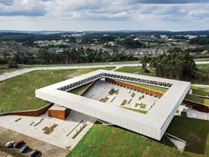 Situated in a largely unoccupied area, the technological park models the ground and introduces a big square steel volume housing offices for creative industries. The ground is translated into a space of crossing that can host outdoor activities. The brief included the design of a public plaza, however, in a context devoid of urban limits, this proved a complex undertaking. The response is a public space as a result of actions in the landscape, inspired by monastic complexes in Portugal. These elementary organising structures declare a clear but non-invasive presence in the territory, through a prevalence of horizontal lines. The steel volume with its exposed structure is an elementary form: a square that introduces the internal organisation of a cloister. The use of reinforced concrete, glass, steel and white rusted steel mesh communicate a diaphanous dimension in the relation between aerial structures and landscape, while the bases touching the ground are built in exposed concrete and black steel. While the suspended square for start-ups has a clear and evident form, the public spaces reveal a layering and complexity that creates free forms of conviviality.
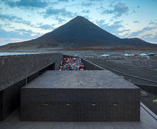
The crater of a volcano on Fogo Island in Cape Verde, 1800 metres above sea level, is home to a village of 1200 illegal occupants of state-owned lands. Situated in this territory-limit, the project confronts an active volcano. The Headquarters for the Parque National do Fogo were conceived like a ribbon that folds back on itself and hosts different functions: an auditorium, a library, a terrace-café and an administrative block of meeting rooms, offices, workshops and technical spaces. Built from panels made of concrete mixed with lava dust, the centre sits in the landscape in the most natural way. Natural ventilation, the use of the roof to collect water and solar panels ensure that the centre is autonomous, sustainable and self-sufficient. A project in a context at the limits of the inhabitable, home to spontaneous appropriations of land, brings a sense of order through the presence of this mysterious, minimal and complex black object.
ARGOMENTI
– Edoardo Tresoldi. Sculture architettoniche tra archeologia e paesaggio – Pag. 106
– Committenza e progettisti per un’architettura di qualità. L’ultima edizione del Premio Internazionale Dedalo Minosse – Pag. 110
– Maidan Tent: una piazza per comunità in transito – Pag. 114
– Il progetto come cura dell’esistente. Riqualificazione di un edificio residenziale a Capo d’Orlando – Pag. 117
– Mediterraneo contemporaneo / Contemporaneo mediterraneo. Criticità e progetto del contesto costiero – Pag. 120
NOTIZIE – Pag. 122
LIBRI – Pag. 126
Questo post è disponibile anche in: Italian


